
10 Proven Landing Page Tips You Can Apply Today To Boost Your Conversion Rates
Increase your SaaS landing page conversions with strategies you can apply today.
I’ve had the pleasure of crafting more than 100+ landing pages for top SaaS brands.
Here are my top 10 tips and landing page best practices for increasing conversion rates.
(In no particular order, they all matter)
TABLE OF CONTENTS
- Tip #1 - Showing the “Aha Moments” in the Hero Section
- Tip #2 - Switching from “Call to Action” to “Call to Value”
- Tip #3 - The Art of Showcasing True Value
- Tip #4 - Contrast: The Psychology Behind Decision-Making in SaaS
- Tip #5 - The Art of Show vs Tell
- Tip #6 - Increase Conversion by Selling Indirectly
- Tip #7 - Showcasing the Crucial 20% That Truly Resonates
- Tip #8 - Minimizing Risk to Maximize Conversion
- Tip #9 - How to Find Those “Aha Moments”
- Tip #10 - The Three Pillars for an Effective Landing Page
- Bonus Tip: Enhance Your Mental Reference
- Conclusion
- Resources for Mastering B2B Advertising
Tip #1 - Showing the “Aha Moments” in the Hero Section
Unlike traditional approaches that cram the hero section with exhaustive product details, the most effective strategy is to spark curiosity.
The hero's purpose transcends mere product selling; it's about unveiling those 'aha' moments that resonate deeply with the audience, compelling them to explore further.
'Aha' moments are those instances of sudden insight or discovery that leave a lasting impression on the audience.
In the hero section, showcasing these moments effectively can be the difference between a visitor bouncing off the page and one who stays to learn more.
For example, rather than just stating that a product simplifies a complex process, demonstrating this transformation through a brief, engaging visual or interactive element can be far more compelling.

The Case for Clarity and Creativity:
Consider a tool that converts audio instructions into a polished presentation.
A straightforward statement like "You talk, we'll write" paired with a generic AI-themed image does little to convey the true potential of the product.
A more effective strategy would involve a dynamic display of an audio clip evolving into a complete slide deck right within the hero section.
This visual demonstration not only clarifies the product's purpose but also instantly showcases its efficiency and innovative approach, making the value proposition clear and compelling from the outset.
Tip #2 - Switching from “Call to Action” to “Call to Value”
A compelling call to action (CTA) is effective not just because it tells users what to do, but because it clearly shows the value they'll get from taking action.
This principle is particularly relevant when discussing how to entice potential users to engage with a SaaS product, whether through booking a demo, signing up for a trial, or merely exploring the features of a tool.
The Strategy of Value-Driven CTAs:
A common misstep in crafting CTAs is the assumption that a straightforward directive—such as "Sign up for free" or "Book a demo"— suffices to motivate action.
However, this overlooks the critical need to communicate the unique benefits that await the user.
We need to shift from a generic call to action to one that vividly presents a 'value proposition'.
For instance, rather than merely inviting potential customers to "book a demo," a more effective approach would illustrate what they can expect to gain from that demo, such as “Book a 30-Minute Demo & Walk Away With 5 Tailored Tips”
Tailoring Experiences to Overcome Skepticism:
Marketers need to ensure that CTAs are not just gateways to product features but also to experiences that address the visitors' needs and concerns.
Particularly in industries where customers are overwhelmed with choices, standing out requires demonstrating immediate and tangible value.
Practical Example:
A service offering insights into optimizing YouTube ad placements might offer a "Free consultation to uncover 10 high-impact ad placements you're missing."
This approach directly speaks to the user's desire to gain an advantage and assures them of receiving valuable insights regardless of their decision to commit to the service.

Leveraging Trust Through Transparency and Results:
Trust plays a major role in converting users from interested observers to active participants. This trust can be significantly bolstered by transparency and evidence of potential results.
A case in point involves a service that automates customer feedback collection, where the CTA emphasizes the realistic outcomes users can expect, such as "Join our trial and see how businesses gain 10+ new reviews in just a week."
Such a statement not only sets clear expectations but also addresses common concerns around efficacy and value for time spent.
Tip #3 - The Art of Showcasing True Value
The debate between emphasizing features versus benefits has long been a topic of discussion.
However, a more profound approach focuses on selling outcomes—a strategy that transcends the traditional split by aligning a product's capabilities directly with the customer's success.
This method does not just highlight what the product can do or the advantages it offers but rather, it shows the tangible impact it will have on a user's objectives, such as enhancing profitability, efficiency, or operational insights.
For example, instead of stating that an analytics tool provides comprehensive data analysis (a feature) or delivers actionable insights (a benefit), outcome-based selling would focus on how it enables businesses to identify and rectify inefficiencies in their ad spend, ultimately increasing ROI.
Crafting an Indirect Promise:
One of the critical nuances of this approach is the subtlety of the promise being made.
Directly stating that a product will lead to more revenue or savings might trigger skepticism. Thus, the art lies in painting a scenario that leads the customer to reach these outcomes naturally.
By detailing the insights or efficiencies a tool provides, customers begin to see the path to increased profits or reduced costs themselves, making the conclusion feel like their discovery rather than a bold claim from the company.

Practical Example:
Consider a service that offers AI-driven call answering for small businesses. Rather than simply stating it answers calls, the marketing message could focus on the outcome:
"Never miss a sale again with our AI receptionist, ensuring you capture every opportunity, 24/7."
Such framing not only addresses the immediate feature but also connects it to a desirable business outcome—increasing sales by capturing every call.
Tip #4 - Contrast: The Psychology Behind Decision-Making in SaaS
Mastering the subtle technique of drawing contrasts does more than just emphasize a product's strengths;
It vividly contrasts the potential customers' current challenges with the brighter prospects that the right solution can offer.
Fundamentally, selling through contrast means outlining the challenges or limitations customers currently face and comparing these with the transformative benefits the product can provide.
The effectiveness of this strategy lies in its ability to magnify the perceived value of a solution, making the switch or become not just logical but, essentially, inevitable.
Crafting Compelling Contrasts:
Creating compelling contrasts requires a deep understanding of the customer's current struggles and how they align with the unique capabilities of the SaaS solution.
This involves asking probing questions that uncover pain points and limitations of current tools or processes and demonstrating how the product not only addresses these issues but also offers additional, unforeseen benefits

Tip #5 - The Art of Show vs Tell
Transcend beyond the superficial allure of adjectives like "fast," "easy," or "better," which, while enticing, often fall short of conveying the true essence and capability of a product.
Demonstrating Value Through Evidence:
The key lies in demonstrating value through clear, undeniable evidence.
For instance, showcasing a time-lapse video of creating a 25-email sequence in 15 minutes delivers a powerful, visual affirmation of the tool's efficiency.
This method not only captures attention but also dispels doubts by providing a visual benchmark for the tool's capability.
The Synergy with Earlier Strategies:
"Show, don't tell" beautifully complements earlier discussed strategies like focusing on outcomes and creating contrast.
It provides the tangible proof that underpins these approaches, ensuring that the marketing message is not just heard but felt and understood.
The landing page below has a short video demonstrating the value to prospects.

Tip #6 - Increase Conversion by Selling Indirectly
The ability to sell outcomes indirectly is not just a tactic; it's an art form.
The essence of this approach lies in the subtle but powerful shift from telling prospects about the benefits of a product to showing them the tangible impact it can have on their operations, revenue, or efficiency.
Direct claims often invite skepticism, whereas indirect suggestions inspire imagination and belief.
The Power of Indirect Selling:
Direct selling, especially when it involves bold claims like being the "number one CRM for a niche," tends to be met with skepticism.
Prospects are bombarded with similar claims daily, making them numb to such assertions.
The challenge, therefore, is to engage their imagination and lead them to the conclusion that your product is the superior choice without explicitly stating it.
This involves painting a picture of the outcomes in a way that the prospect can see themselves achieving these results with your product.
Practical Example:
Consider the scenario of a dental practice missing calls—and thereby potential business—outside of office hours.
Instead of merely stating that an AI receptionist tool can save them money and time, the narrative is constructed around the loss incurred when calls go unanswered.
By quantifying the potential loss (e.g., "every missed call could cost you a thousand dollars"), the message effectively highlights the cost of inaction.
This approach leverages the fear of loss, a potent motivator, making the solution offered by the product not just desirable but necessary.
Another innovative approach is using analytics and user feedback mechanisms within the product itself to remind users of the value they're missing by not upgrading.

Tip #7 - Showcasing the Crucial 20% That Truly Resonates
The effectiveness of a landing page can significantly influence a company's conversion rates.
Simplicity is one of the most important components of a successful landing page, yet it is often overlooked.
Rather than bombarding potential customers with every detail and feature of the product, present just enough information to pique interest and guide visitors to the next step.
The primary goal of a landing page is not to sell the product in its entirety but to entice visitors with a compelling overview that encourages them to explore further.
Say more with less:
- Show, Don't Overwhelm: overloading a page with information can deter potential leads.
- Simplify the Decision-Making Process: by offering a snapshot rather than a deep dive, companies can make it easier for prospects to decide and engage further with the product.
- Address Key Objections Proactively: incorporating elements that address key objections can transform a passive viewer into an active lead.

Every potential customer comes with a set of preconceived notions and concerns that could hinder their willingness to engage with a product.
Successful landing pages anticipate these objections and address them upfront.
This proactive strategy serves two purposes:
- Reassures visitors that their concerns are recognized
- Positions the company as attentive and customer-centric.
For instance, if a common objection is the perceived complexity of integrating a new software tool into existing workflows, a landing page might feature testimonials from users who found the process straightforward and supported.
This kind of social proof can alleviate concerns and motivate visitors to take the next step.
Practical Example:
Consider a SaaS product designed to enhance project management.
Instead of listing every feature and tool available, focus on showcasing how it simplifies project tracking, enhances team collaboration, and leads to better project outcomes.
Use visuals and brief case studies to demonstrate the benefits.
This method not only captures interest but also sets the stage for visitors to discover more by trying the product themselves.
The Role of the Landing Page in the Sales Process:
The landing page itself is not the end goal but a means to an end.
The ultimate objective is to guide visitors toward making a decision.
So, the landing page should be designed with this goal in mind, ensuring that the call-to-action (CTA) is clear, compelling, and aligned with what visitors are seeking.
This concept extends to product-led growth companies, where even free products require a degree of selling.
In this context, the landing page must convincingly communicate the value of trying the product, addressing any barriers to action, such as time investment or skepticism based on past experiences with similar tools.
Tip #8 - Minimizing Risk to Maximize Conversion
Removing perceived risk is often more straightforward and impactful than detailing the outcome.
This approach centers on simplifying the decision-making process for potential users by alleviating their concerns and highlighting ease of use.
The Challenge of Clarifying Outcomes:
Clarifying the outcome a product or service offers can be a complex task, requiring precise language and a deep understanding of the audience's needs and expectations.
It involves not just stating what the product does, but also communicating its value in a way that resonates with potential users.
This can be particularly challenging when dealing with innovative or complex solutions where the benefits are not immediately apparent.
Easing the Path to Conversion:
Contrary to the complex process of defining outcomes, mitigating risk for the user often follows a more straightforward path.
It involves clear, actionable steps that directly address common concerns and barriers to entry.
Possible actions include:
- Enhancing Call to Actions
- Addressing Objections Proactively
- Showcasing Practical Examples
Removing risk transforms the decision-making process from a calculation into an opportunity.
When potential users feel that they have nothing to lose and everything to gain, the barrier to taking the next step lowers significantly.

Tip #9 - How to Find Those “Aha Moments”
Identifying “ Aha Moments” requires a deep understanding of the user experience, often achieved through collaboration with teams directly interacting with customers, such as sales and support.
Once identified, these moments should be prominently featured on the landing page.
This could involve detailed case studies, interactive demos, or succinct bullet points that directly address common questions or concerns.
For instance, if a product offers unprecedented ease of use, showing a quick video of someone setting up a complex task in minutes can be incredibly persuasive.

Practical Example:
Illustrating how a product can solve a problem in a way that no other can, such as automating a task that typically takes hours into just a few clicks, can instantly communicate its value.
Practical examples not only aid in understanding but also help potential users envision themselves benefiting from the product.
Tip #10 - The Three Pillars for an Effective Landing Page
Creating an effective landing page is like constructing a building.
It requires a solid foundation and supportive pillars to ensure stability and function.
There are three critical pillars that, when thoroughly crafted and harmonized, can significantly enhance the page's effectiveness and conversion rates.
These pillars are:
- Results: the promise of value
- Perceived Superiority: standing out from the competition
- Risk Mitigation: lowering the barriers to adoption
This approach ensures that every element of the landing page works in harmony to support the ultimate goal:
Driving conversions and achieving business objectives.
Bonus Tip: Enhance Your Mental Reference
Just as artists draw from a vast mental library of images and concepts to create something novel and breathtaking, landing page designers and copywriters must build their own collection of inspirational references.
This mental database enables them to recognize and apply successful elements from various sources, combining them in innovative ways that resonate with their specific audience.
How to build your mental reference:
- Curate Examples: actively seek out and save examples of landing pages, ads, copy, and designs that catch your attention. some text
- Tools like Pinterest or dedicated design inspiration websites can be invaluable.
- Tools like Pinterest or dedicated design inspiration websites can be invaluable.
- Analyze What Works: don't just collect examples; study them.some text
- What makes a particular landing page effective?
- How does it engage its audience?
- How are the visuals and copy aligned to convey a compelling message?
- Learn from Various Industries: broaden your horizons by exploring successful landing pages across different sectors.
- Stay Updated: the digital landscape is ever-evolving, and so are the trends in landing page design and copywriting. Keeping up-to-date with the latest trends ensures your mental reference is not only vast but also relevant.
Conclusion:
In crafting effective landing pages, the key lies in simplicity, clarity, and focusing on the product's true value.
By enticing users with outcomes rather than overwhelming them with features, addressing their concerns upfront, and demonstrating the tangible benefits they stand to gain, companies can significantly boost conversions.
This holistic approach, from spotlighting product essence to leveraging contrast and indirect selling, transforms landing pages from mere entry points into powerful catalysts for customer engagement and success.
Resources for Mastering B2B Advertising
If you’re serious about mastering B2B advertising then you definitely need to join 1,000+ B2B marketers leveling up their paid advertising skill sets in AdConversion.
Here’s 4 reasons why you should consider joining. Every one of our on-demand courses are:
✅ 100% free access.
✅ Taught by vetted industry experts.
✅ Have workbooks, resources, and templates.
✅ Less than 10 minutes per lesson.
We believe every marketer should know how to scale paid ads so they can:
- Scale their ideas
- Level up their careers
- Make a positive impact
Click Here to Join 1,000+ B2B Marketers Today and start leveling up your advertising skill set.
Takes < 90 seconds to sign up (seriously we timed it 😂)
People Also Ask
How can I effectively measure the success of my landing page optimizations?
Utilize analytics tools to monitor key performance indicators (KPIs) like conversion rates, bounce rates, and average session duration. A/B testing different elements can also provide insights into what changes resonate with your audience.
What are common pitfalls to avoid during landing page optimization?
Avoid cluttered designs, slow load times, and unclear calls-to-action. Ensuring mobile responsiveness and aligning content with user intent are also crucial to prevent high bounce rates.
How often should I update or test my landing pages?
Regularly review performance metrics and conduct A/B tests, especially when introducing new products or campaigns. Continuous optimization helps maintain relevance and effectiveness.
What role does SEO play in landing page optimization?
Incorporating relevant keywords, optimizing meta tags, and ensuring fast load times can improve search engine rankings, driving more organic traffic to your landing page.
How can I personalize landing pages for different audience segments?
Use dynamic content to tailor messages based on user demographics, behavior, or referral sources, creating a more personalized and engaging experience.

Heading 1
Heading 2
Heading 3
Heading 4
Heading 5
Heading 6
Lorem ipsum dolor sit amet, consectetur adipiscing elit, sed do eiusmod tempor incididunt ut labore et dolore magna aliqua. Ut enim ad minim veniam, quis nostrud exercitation ullamco laboris nisi ut aliquip ex ea commodo consequat. Duis aute irure dolor in reprehenderit in voluptate velit esse cillum dolore eu fugiat nulla pariatur.
Block quote
Ordered list
- Item 1
- Item 2
- Item 3
Unordered list
- Item A
- Item B
- Item C
Bold text
Emphasis
Superscript
Subscript


Heading
Heading 1
Heading 2
Heading 3
Heading 4
Heading 5
Heading 6
Lorem ipsum dolor sit amet, consectetur adipiscing elit, sed do eiusmod tempor incididunt ut labore et dolore magna aliqua. Ut enim ad minim veniam, quis nostrud exercitation ullamco laboris nisi ut aliquip ex ea commodo consequat. Duis aute irure dolor in reprehenderit in voluptate velit esse cillum dolore eu fugiat nulla pariatur.
Block quote
Ordered list
- Item 1
- Item 2
- Item 3
Unordered list
- Item A
- Item B
- Item C
Bold text
Emphasis
Superscript
Subscript


Heading
Heading 1
Heading 2
Heading 3
Heading 4
Heading 5
Heading 6
Lorem ipsum dolor sit amet, consectetur adipiscing elit, sed do eiusmod tempor incididunt ut labore et dolore magna aliqua. Ut enim ad minim veniam, quis nostrud exercitation ullamco laboris nisi ut aliquip ex ea commodo consequat. Duis aute irure dolor in reprehenderit in voluptate velit esse cillum dolore eu fugiat nulla pariatur.
Block quote
Ordered list
- Item 1
- Item 2
- Item 3
Unordered list
- Item A
- Item B
- Item C
Bold text
Emphasis
Superscript
Subscript


Heading
Heading 1
Heading 2
Heading 3
Heading 4
Heading 5
Heading 6
Lorem ipsum dolor sit amet, consectetur adipiscing elit, sed do eiusmod tempor incididunt ut labore et dolore magna aliqua. Ut enim ad minim veniam, quis nostrud exercitation ullamco laboris nisi ut aliquip ex ea commodo consequat. Duis aute irure dolor in reprehenderit in voluptate velit esse cillum dolore eu fugiat nulla pariatur.
Block quote
Ordered list
- Item 1
- Item 2
- Item 3
Unordered list
- Item A
- Item B
- Item C
Bold text
Emphasis
Superscript
Subscript


Heading
Heading 1
Heading 2
Heading 3
Heading 4
Heading 5
Heading 6
Lorem ipsum dolor sit amet, consectetur adipiscing elit, sed do eiusmod tempor incididunt ut labore et dolore magna aliqua. Ut enim ad minim veniam, quis nostrud exercitation ullamco laboris nisi ut aliquip ex ea commodo consequat. Duis aute irure dolor in reprehenderit in voluptate velit esse cillum dolore eu fugiat nulla pariatur.
Block quote
Ordered list
- Item 1
- Item 2
- Item 3
Unordered list
- Item A
- Item B
- Item C
Bold text
Emphasis
Superscript
Subscript


Heading
Heading 1
Heading 2
Heading 3
Heading 4
Heading 5
Heading 6
Lorem ipsum dolor sit amet, consectetur adipiscing elit, sed do eiusmod tempor incididunt ut labore et dolore magna aliqua. Ut enim ad minim veniam, quis nostrud exercitation ullamco laboris nisi ut aliquip ex ea commodo consequat. Duis aute irure dolor in reprehenderit in voluptate velit esse cillum dolore eu fugiat nulla pariatur.
Block quote
Ordered list
- Item 1
- Item 2
- Item 3
Unordered list
- Item A
- Item B
- Item C
Bold text
Emphasis
Superscript
Subscript


Heading
Heading 1
Heading 2
Heading 3
Heading 4
Heading 5
Heading 6
Lorem ipsum dolor sit amet, consectetur adipiscing elit, sed do eiusmod tempor incididunt ut labore et dolore magna aliqua. Ut enim ad minim veniam, quis nostrud exercitation ullamco laboris nisi ut aliquip ex ea commodo consequat. Duis aute irure dolor in reprehenderit in voluptate velit esse cillum dolore eu fugiat nulla pariatur.
Block quote
Ordered list
- Item 1
- Item 2
- Item 3
Unordered list
- Item A
- Item B
- Item C
Bold text
Emphasis
Superscript
Subscript


Heading
Heading 1
Heading 2
Heading 3
Heading 4
Heading 5
Heading 6
Lorem ipsum dolor sit amet, consectetur adipiscing elit, sed do eiusmod tempor incididunt ut labore et dolore magna aliqua. Ut enim ad minim veniam, quis nostrud exercitation ullamco laboris nisi ut aliquip ex ea commodo consequat. Duis aute irure dolor in reprehenderit in voluptate velit esse cillum dolore eu fugiat nulla pariatur.
Block quote
Ordered list
- Item 1
- Item 2
- Item 3
Unordered list
- Item A
- Item B
- Item C
Bold text
Emphasis
Superscript
Subscript


Heading
Heading 1
Heading 2
Heading 3
Heading 4
Heading 5
Heading 6
Lorem ipsum dolor sit amet, consectetur adipiscing elit, sed do eiusmod tempor incididunt ut labore et dolore magna aliqua. Ut enim ad minim veniam, quis nostrud exercitation ullamco laboris nisi ut aliquip ex ea commodo consequat. Duis aute irure dolor in reprehenderit in voluptate velit esse cillum dolore eu fugiat nulla pariatur.
Block quote
Ordered list
- Item 1
- Item 2
- Item 3
Unordered list
- Item A
- Item B
- Item C
Bold text
Emphasis
Superscript
Subscript


Heading
Heading 1
Heading 2
Heading 3
Heading 4
Heading 5
Heading 6
Lorem ipsum dolor sit amet, consectetur adipiscing elit, sed do eiusmod tempor incididunt ut labore et dolore magna aliqua. Ut enim ad minim veniam, quis nostrud exercitation ullamco laboris nisi ut aliquip ex ea commodo consequat. Duis aute irure dolor in reprehenderit in voluptate velit esse cillum dolore eu fugiat nulla pariatur.
Block quote
Ordered list
- Item 1
- Item 2
- Item 3
Unordered list
- Item A
- Item B
- Item C
Bold text
Emphasis
Superscript
Subscript


Heading
Heading 1
Heading 2
Heading 3
Heading 4
Heading 5
Heading 6
Lorem ipsum dolor sit amet, consectetur adipiscing elit, sed do eiusmod tempor incididunt ut labore et dolore magna aliqua. Ut enim ad minim veniam, quis nostrud exercitation ullamco laboris nisi ut aliquip ex ea commodo consequat. Duis aute irure dolor in reprehenderit in voluptate velit esse cillum dolore eu fugiat nulla pariatur.
Block quote
Ordered list
- Item 1
- Item 2
- Item 3
Unordered list
- Item A
- Item B
- Item C
Bold text
Emphasis
Superscript
Subscript


Heading
Heading 1
Heading 2
Heading 3
Heading 4
Heading 5
Heading 6
Lorem ipsum dolor sit amet, consectetur adipiscing elit, sed do eiusmod tempor incididunt ut labore et dolore magna aliqua. Ut enim ad minim veniam, quis nostrud exercitation ullamco laboris nisi ut aliquip ex ea commodo consequat. Duis aute irure dolor in reprehenderit in voluptate velit esse cillum dolore eu fugiat nulla pariatur.
Block quote
Ordered list
- Item 1
- Item 2
- Item 3
Unordered list
- Item A
- Item B
- Item C
Bold text
Emphasis
Superscript
Subscript


Heading
Heading 1
Heading 2
Heading 3
Heading 4
Heading 5
Heading 6
Lorem ipsum dolor sit amet, consectetur adipiscing elit, sed do eiusmod tempor incididunt ut labore et dolore magna aliqua. Ut enim ad minim veniam, quis nostrud exercitation ullamco laboris nisi ut aliquip ex ea commodo consequat. Duis aute irure dolor in reprehenderit in voluptate velit esse cillum dolore eu fugiat nulla pariatur.
Block quote
Ordered list
- Item 1
- Item 2
- Item 3
Unordered list
- Item A
- Item B
- Item C
Bold text
Emphasis
Superscript
Subscript


Heading
Heading 1
Heading 2
Heading 3
Heading 4
Heading 5
Heading 6
Lorem ipsum dolor sit amet, consectetur adipiscing elit, sed do eiusmod tempor incididunt ut labore et dolore magna aliqua. Ut enim ad minim veniam, quis nostrud exercitation ullamco laboris nisi ut aliquip ex ea commodo consequat. Duis aute irure dolor in reprehenderit in voluptate velit esse cillum dolore eu fugiat nulla pariatur.
Block quote
Ordered list
- Item 1
- Item 2
- Item 3
Unordered list
- Item A
- Item B
- Item C
Bold text
Emphasis
Superscript
Subscript


Heading
Heading 1
Heading 2
Heading 3
Heading 4
Heading 5
Heading 6
Lorem ipsum dolor sit amet, consectetur adipiscing elit, sed do eiusmod tempor incididunt ut labore et dolore magna aliqua. Ut enim ad minim veniam, quis nostrud exercitation ullamco laboris nisi ut aliquip ex ea commodo consequat. Duis aute irure dolor in reprehenderit in voluptate velit esse cillum dolore eu fugiat nulla pariatur.
Block quote
Ordered list
- Item 1
- Item 2
- Item 3
Unordered list
- Item A
- Item B
- Item C
Bold text
Emphasis
Superscript
Subscript


Heading
Heading 1
Heading 2
Heading 3
Heading 4
Heading 5
Heading 6
Lorem ipsum dolor sit amet, consectetur adipiscing elit, sed do eiusmod tempor incididunt ut labore et dolore magna aliqua. Ut enim ad minim veniam, quis nostrud exercitation ullamco laboris nisi ut aliquip ex ea commodo consequat. Duis aute irure dolor in reprehenderit in voluptate velit esse cillum dolore eu fugiat nulla pariatur.
Block quote
Ordered list
- Item 1
- Item 2
- Item 3
Unordered list
- Item A
- Item B
- Item C
Bold text
Emphasis
Superscript
Subscript


Heading
Heading 1
Heading 2
Heading 3
Heading 4
Heading 5
Heading 6
Lorem ipsum dolor sit amet, consectetur adipiscing elit, sed do eiusmod tempor incididunt ut labore et dolore magna aliqua. Ut enim ad minim veniam, quis nostrud exercitation ullamco laboris nisi ut aliquip ex ea commodo consequat. Duis aute irure dolor in reprehenderit in voluptate velit esse cillum dolore eu fugiat nulla pariatur.
Block quote
Ordered list
- Item 1
- Item 2
- Item 3
Unordered list
- Item A
- Item B
- Item C
Bold text
Emphasis
Superscript
Subscript


Heading
Heading 1
Heading 2
Heading 3
Heading 4
Heading 5
Heading 6
Lorem ipsum dolor sit amet, consectetur adipiscing elit, sed do eiusmod tempor incididunt ut labore et dolore magna aliqua. Ut enim ad minim veniam, quis nostrud exercitation ullamco laboris nisi ut aliquip ex ea commodo consequat. Duis aute irure dolor in reprehenderit in voluptate velit esse cillum dolore eu fugiat nulla pariatur.
Block quote
Ordered list
- Item 1
- Item 2
- Item 3
Unordered list
- Item A
- Item B
- Item C
Bold text
Emphasis
Superscript
Subscript


Heading
Heading 1
Heading 2
Heading 3
Heading 4
Heading 5
Heading 6
Lorem ipsum dolor sit amet, consectetur adipiscing elit, sed do eiusmod tempor incididunt ut labore et dolore magna aliqua. Ut enim ad minim veniam, quis nostrud exercitation ullamco laboris nisi ut aliquip ex ea commodo consequat. Duis aute irure dolor in reprehenderit in voluptate velit esse cillum dolore eu fugiat nulla pariatur.
Block quote
Ordered list
- Item 1
- Item 2
- Item 3
Unordered list
- Item A
- Item B
- Item C
Bold text
Emphasis
Superscript
Subscript


Heading
Heading 1
Heading 2
Heading 3
Heading 4
Heading 5
Heading 6
Lorem ipsum dolor sit amet, consectetur adipiscing elit, sed do eiusmod tempor incididunt ut labore et dolore magna aliqua. Ut enim ad minim veniam, quis nostrud exercitation ullamco laboris nisi ut aliquip ex ea commodo consequat. Duis aute irure dolor in reprehenderit in voluptate velit esse cillum dolore eu fugiat nulla pariatur.
Block quote
Ordered list
- Item 1
- Item 2
- Item 3
Unordered list
- Item A
- Item B
- Item C
Bold text
Emphasis
Superscript
Subscript


Heading
Other Articles You May Enjoy.
10 Tips to Design an Effective LinkedIn Ads Funnel Architecture
Over the past 5 years, I’ve helped hundreds of B2B SaaS companies develop a strong LinkedIn Ads funnel architecture.
This has allowed them to show up in front of the right audiences, with the right messages, at the right time, ultimately leading to more pipeline and revenue.
I’ll be breaking down my entire methodology below.
Let’s dive in.👇
TABLE OF CONTENTS
- Tip #1: Outline your variables
- Tip #2: Whiteboard your funnel
- Tip #3: Set clear campaign goals
- Tip #4: Create ads that match the funnel stage
- Tip #5: Don’t forget attribution
- Tip #6: Get efficient before getting fancy
- Tip #7: Retarget like a pro
- Tip #8: Test smart, not random
- Tip #9: Keep tabs on performance
- Tip #10: Learn, improve, repeat
Tip #1: Outline your variables
Before you do anything else, you want to outline all your variables.
What audiences do you need to target? Are they actually active on LinkedIn or will you have to try with a different platform? How large are your audience sizes? How much budget do you have? What content do you have available to you and what gaps do you currently have?
You need to put all those pieces on the table to understand if LinkedIn is a viable channel for you in the first place.
If you have minimal content, a small budget, and an audience that isn’t very active on LinkedIn, you’re setting yourself up for failure.

Tip #2: Whiteboard your funnel
Once you have your pieces on the table, you can use Figma, Miro, or simply pen and paper (my personal preference) to start mapping out your funnel.
For example, let’s say you’ve created your audience and have identified that your TAM is around half a million people. But maybe your ideal ICP — which you want to start targeting with ads — is only 65K people.
Now, you need to ask yourself the question: what type of content would this audience find interesting and push them further down the funnel?
Maybe, to start, they’d want to see something funny related to a pain point they’re having. Next, they might want to see more content related to this pain point, in addition to product videos and testimonials. Eventually, they might be open to requesting a demo.
Ultimately, you want to map out the journey that you want your prospects to take; even if they don’t follow this exact journey — which they probably won’t — doing this exercise forces you to have empathy for them, and your content ecosystem will be more likely to move the needle.
Tip #3: Set clear campaign goals
A goalie, defender, midfielder, and striker all have different roles and shouldn’t be judged by the same criteria.
The same is true for ad campaigns.
Top of funnel, bottom of funnel, cross-sell, upsell, and pipeline acceleration campaigns are completely different, and need to be judged by completely different metrics.
Before spending any money, it’s important to clearly define the KPIs for your campaigns.
For example, for a top of funnel campaign to a cold audience, your goal might be to maximize engagement, and you might be looking at metrics such as engagement rate and cost per engagement.
For a bottom of the funnel campaign, you might be assessing performance by looking at metrics such as cost per demo, cost per SQL, or cost per opportunity.
Defining these key metrics is essential — if you fail to define them, your leadership team might ask you to pause all your top of funnel/awareness campaigns because they haven’t generated enough demo requests 😥
Tip #4: Create ads that match the funnel stage
A lot of people these days say things like the B2B buyer’s journey isn’t linear and the funnel isn’t actually real, and sure, that’s true, but it’s still meaningful to match the content/offer to the level of awareness of your prospect.
Someone who visited your LinkedIn company page 11 months ago probably shouldn’t be seeing the same content as someone who visited your pricing page yesterday.
With the ads in the cold layer, you’re showing up unannounced in someone’s feed, and you’re simply looking to pique their curiosity.
Once they’ve engaged with you multiple times, you can start being a bit more direct (promoting demos, trials, sign ups, etc.).
Aside from the funnel stage, you also might want to segment your ads by persona — for example, CFOs, salespeople, and product people will all care about different things, and should be seeing customized messaging based on their needs and concerns.
One caveat: you have to be careful to not make your audience too small.
If you segment by region, funnel stage, and persona, you may not have a large enough audience size to run a campaign.
If this happens, you’ll have to triage and decide which targeting criteria to prioritize.
Tip #5: Don’t forget attribution
This might seem basic but it has to be said.
You don’t need a super complex attribution setup, but you do want to have an idea of what campaigns are driving an incremental lift in pipeline.
If you don’t have access to an attribution tool like Dreamdata or HockeyStack, here’s a simple way to start doing this:
For high-value conversions (ie qualified lead, demo request, or opportunity), in addition to your standard last touch/last conversion event, set up a duplicate last touch/each conversion event, with a 90-day click/90-day view window and a very small value (ie 1 cent).
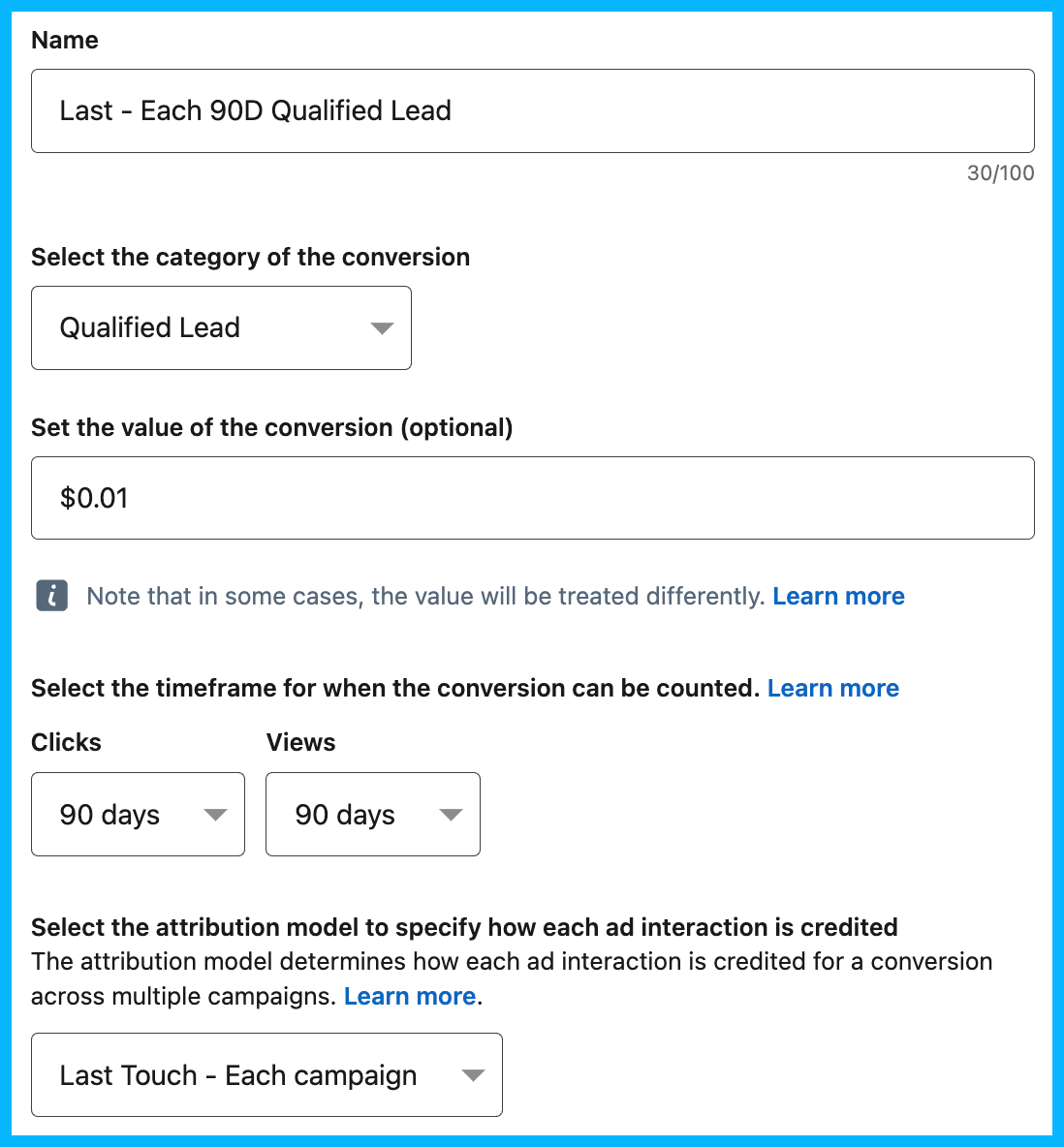
By doing this, you’ll find that some campaigns that you believed weren’t performing are actually driving — or at least influencing — a significant amount of conversions.
Aside from this, it’s a good idea to look at different sources to build a more complete picture of what’s working: in-platform attribution, your CRM, self-reported attribution, Gong call mentions, conversion API, the revenue attribution report, etc.
It’s also helpful to look at both directly attributed and blended pipeline quarter over quarter. If these numbers, along with your pipe-to-spend ratio, are consistently increasing, it’s a good indicator that your campaigns are working.
Tip #6: Get efficient before getting fancy
In order to be effective, you first need to be efficient.
I like using the example of a car: if you need to drive 50 miles, it’s going to be much more difficult if your oil hasn’t been changed, your tires are flat, and you only have a quarter tank of gas.
The same thing is true for LinkedIn Ads: using the LinkedIn audience network, enabling audience expansion, not leveraging exclusions, using too many exclusions, targeting too many people, not targeting enough people, using OR instead of AND or AND instead of OR, using the wrong campaign objective, choosing the wrong bid strategy, etc.
These are issues I see all the time, and though they may seem minor, they have a huge impact on overall performance.
You won’t hit your pipeline and revenue targets if you don’t pay attention to the smaller details.
Tip #7: Retarget like a pro
Effective retargeting requires a nuanced approach.
Prospects who have visited your site in the past 30 days are more likely to request a demo/book a call, so it’d be appropriate for them to see ads with a more direct CTA.
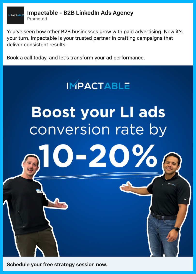
Prospects in your general 90-day remarketing audience might be considering different products/services, so case studies, testimonials, thought leadership, and other trust-building content might push them further down the funnel.
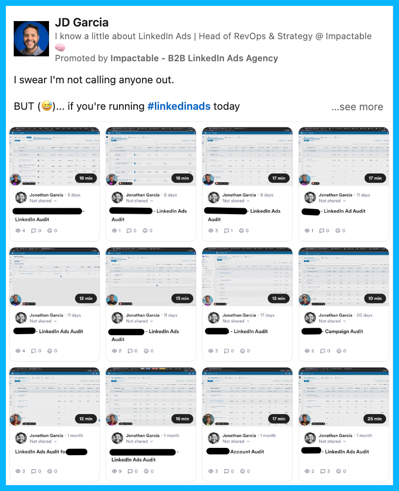
People in your 180-day remarketing audience may not be in-market anymore, but you can stay in front of them for a very low cost using different LinkedIn ad formats such as text and spotlight ads.
If the prospects in your 90 or 180-day remarketing audiences engage with your ads and visit your site, they’ll enter the 30-day remarketing audience and see more direct demo request/book a call ads.
If the prospects in the 30-day remarketing audience don’t engage with your demo ads, they’ll get pulled into the 90-day remarketing layer.
Ultimately, by creating this remarketing ecosystem, you’ll make sure you’re A) capitalizing on people who are in-market and B) staying top of mind with prospects who aren’t ready to buy just yet.
To learn exactly how to set up your retargeting audiences, take a look at this retargeting blueprint.
Tip #8: Test smart, not random
You should be constantly testing elements in your campaigns to maximize performance: different copy, pain points, landing pages, targeting criteria, etc.
But you want to make sure that all your tests are both meaningful and insightful.
For example, testing a blue creative vs. a red creative wouldn’t be meaningful; instead, you’d want to test more significant elements, e.g. testing one messaging angle vs. another, or testing a native audience vs. an ABM audience.
Also, it’s important to conduct proper A/B tests — they’re called A/B tests and not A/B/C/D/E/F/G tests for a reason 😅— to extract accurate insights from your experimentation. If you’re simultaneously testing copy, creatives, pain points, landing pages, and targeting, you’ll have no idea what led to an improvement in results.
Pro tip: To ensure that your tests are both meaningful and insightful, you can use this simple experimentation formula If we do X, I believe Y, as measured by Z.
Tip #9: Keep tabs on performance
This is another tip that might seem obvious, but is often overlooked.
If you’re testing campaigns with different audiences, you need to keep a close eye on which audience performs better.
If you’re testing two ads with different messaging angles, you need to see which ad has more engagement and a higher CTR.
If you’re testing two different landing pages, you need to see which page has the most engaged visits and conversions.
To be clear, I’m advocating for keeping a close eye on performance — not constantly tweaking things in your account.
If you’ve set your campaigns up strategically, you don’t need to be making changes every day, and want to give LinkedIn’s algorithm the time to optimize and learn.
Pro Tip: I typically recommend allowing an ad to spend around $100 before shutting it down — sometimes, an ad that starts out slow can end up being a top-performer.
Tip #10: Learn, improve, repeat
With ad campaigns, you never reach a final destination; in other words, your job is never finished.
If your ads performed well this quarter, you’ll need to find a way to improve performance the following quarter.
You’ll have to sit down and ask yourself:
1. What worked well that we should continue doing in the future?
2. What didn’t go well that we should pause moving forward?
3. Based on what we’ve learned, are there any new tests that could move the needle and improve results?
If you aren’t constantly improving, you’ll likely get left behind by the competition.
Hope you found this article helpful!
If you’re looking to learn more about LinkedIn Ads, check out these free LinkedIn Ads courses, that will teach you how to launch, optimize, and scale LinkedIn Ads campaigns effectively.
And if you have any questions about LinkedIn Ads, feel free to send me a message on LinkedIn.
10 Tips to Make Google Ads Work for Your B2B SaaS Company
Running Google Ads today isn’t the same as running Google Ads in 2015.
What years ago was a winning strategy no longer is, and will only lead to headaches, poor leads, and wasted spend.
Many marketers have already abandoned Google entirely, claiming that it doesn’t work anymore or it’s a waste of money — but this, in my experience, isn’t true.
Over the past few years, I’ve helped B2B SaaS companies such as Dreamdata, Airtame, and Templafy drive millions in revenue through Google Ads, and have developed a repeatable strategy to maximize performance.
I’ll be sharing my tips for success below 👇
TABLE OF CONTENTS
- Tip#1: Set up quality conversion tracking
- Tip #2: Consolidate your campaigns and ad groups
- Tip #3: Focus on exclusions
- Tip #4: Create fast and relevant landing pages
- Tip #5: Leverage smart bidding
- Tip #6: Decrease the amount of RSAs per ad group
- Tip #7: Pin you headlines
- Tip #8: Don’t forget about device adjustments
- Tip #9: Figure out whether you should bid on your own brand or not
- Tip #10: Separate Brand and Non-Brand in your reporting
- Bonus tip: Dive deeper into your performance by country
Tip #1: Set up quality conversion tracking
Many companies are simply tracking form submits, without paying attention to lead quality. This makes optimization challenging, both for the performance marketer managing the account and for the Google Ads algorithm.
To improve performance, make sure you send all the lifecycle stages from your CRM back into the Google Ads platform — this might look like MQLs, SALs, opportunities, etc. — and assign higher values to higher value conversions, so that Google’s algorithm understands what to optimize for.
If you’re using HubSpot as a CRM, this process will be very simple, as your Click IDs will automatically be captured without requiring a manual setup.
If you’re using a different CRM, you’ll need to manually push your click IDs into your CRM using hidden fields — this process might seem complicated, but you should be able to find a marketing operations specialist on Upwork that can help you with the initial setup.
Tip #2: Consolidate your campaigns and ad groups
In the past, when exact match was still exact, SKAGs (single keyword ad groups) made sense.
By including one keyword per ad group and using that keyword in the ad and landing page copy, you could improve your overall quality score.
Now that exact match is a lot less exact, this approach doesn’t make sense anymore.
These days, consolidation is the way to win — by grouping relevant keywords into the same ad group, we give the Google Ads algorithm more data points to make optimizations.
Tip #3: Focus on exclusions
With exact match being less exact, exclusions are now more important than inclusions.
In other words, instead of trying to come up with hundreds of keywords to include in your campaigns, it’s better to spend your time excluding hundreds of irrelevant keywords.
For example, maybe you want to show up for the keyword customer journey tracking, but notice in your search terms report that you’re consistently showing up for the term customer journey mapping, which isn’t relevant to your core offering. By excluding different variations of customer journey mapping, you’ll be able to improve your overall targeting and get in front of more relevant prospects.

Pro tip: In the Google Ads reporting section, you can easily create a search terms report and schedule it to be emailed to you on a weekly basis. This will allow you to be more proactive about making exclusions in your account.
Tip #4: Create fast and relevant landing pages
Landing pages are one of the most overlooked aspects of Google Ads performance.
If they aren’t loading quickly, Google will lower your quality score and it will be nearly impossible to get in front of your prospects. Before launching any campaign, double check that your landing pages are loading quickly on both mobile and desktop devices.
Next, make sure your landing page is as closely related as possible to the keywords in your ad group. For a product analytics ad group, you’d want your landing page to focus on product analytics. For a marketing analytics ad group, you’d want your landing page to focus on marketing analytics.
Take a look at the customized landing pages below:
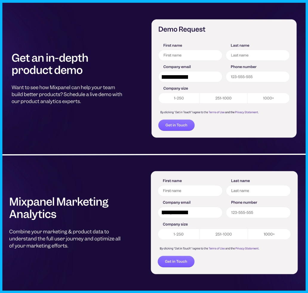
This message match will improve your quality score and will also improve the relevance for your prospects, leading to better performance.
I know that creating new landing pages can be a heavy lift, especially if you have a small team. If this is the case, I recommend duplicating an existing landing page and simply modifying the hero section. Once you start seeing some initial traction from this simple landing page, you can put in the extra effort to create a fully customized experience.
Pro tip: To check the speed of your landing pages, you can use a free tool such as PageSpeed Insights.
Tip #5: Leverage Smart Bidding
Sometimes, smart bidding doesn’t make sense. For example, if you’re starting a new campaign and have zero conversions, it’s a better idea to start with manual CPC or maximize clicks with a bid cap.
However, once you have 10+ conversions per campaign, you’ll typically see better performance if you switch over to smart bidding and let Google optimize for you.
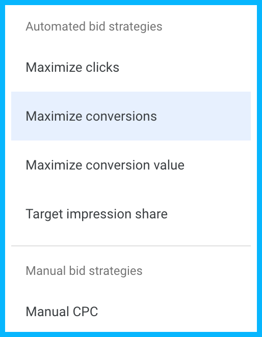
This wasn’t always the case — in the past, Google’s algorithm was much less sophisticated, and you were better off trying to control every single bid adjustment.
But these days, you’ll usually see more traffic and an increase in conversions by letting go of control, as long as you’re feeding Google high quality signals from your CRM.
As with everything in marketing, there are exceptions, and there are instances where you’ll switch to smart bidding and your CPCs will skyrocket 😨
If this happens, consider testing a portfolio bidding strategy with a target CPA and a bid cap — this will mimic max conversions bidding while giving you more control over the cost per click.
Tip #6: Decrease the amount of RSAs per ad group
Most people think that having more responsive search ads = more variations for Google = better performance.
But the opposite is actually true.
Let’s say you create 3 RSAs, and have 15 headlines per ad. This means that Google will have to test 45 different headlines until it finds a winning combination, which could take years 😅
If you only include 1 RSA per ad group (maximum two), your headlines will be tested much faster and Google will be able to find a winning combination more easily, minimizing wasted spend and improving overall results.
Pro tip: If you have a small budget, you might want to take things a step further, and test 6-9 headlines instead of 15. This way, Google will be able to test all the headlines in a matter of weeks (not years).
Tip #7: Pin your headlines
There’s still a lot of debate around pinning vs not pinning headlines.
Some people say that pinning is a bad idea, since it will negatively impact your ad strength, but ultimately, Google’s ad strength has no bearing on performance.
I’ve seen more success with pinning because it makes your headlines more legible — if your ads are clear and searchers have a better understanding of what your company does, you’ll see an improvement in performance.
If your headlines are redundant — as often happens with unpinned headlines, which leads to words like Google Ads agency and Google Ads consultant being next to each other — prospects are less likely to trust you, and much less likely to click.
Here’s the exact formula that I like to follow for my headlines:
Headline 1: Include your target keyword to maximize relevance
Headline 2: Include unique selling points or social proof
Headline 3: Include your company name or a relevant CTA

For each headline, I like to create 2-3 variations that Google can test.
Pro tip: Spend most of your time crafting headlines 1 and 2. Headline 3 is much less important these days, as Google rarely displays it in the SERP.
Tip #8: Don’t forget about device adjustments
Oftentimes, certain devices will significantly outperform others.
For example, if you see that 20% of your spend and 90% of your conversions are happening on desktop, you might want to add a negative bid adjustment to mobile devices or tablets, in order to increase the budget allocated to desktop.
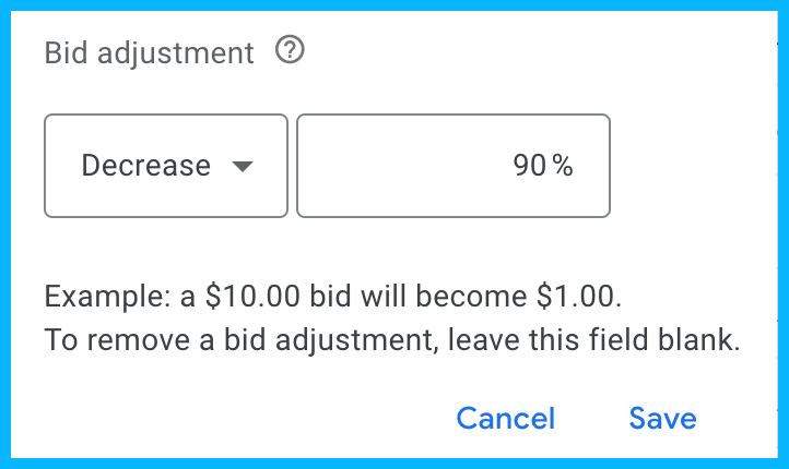
You could argue that mobile impressions are still valuable, and that decreasing spend on mobile could negatively impact performance if people are researching on their phones and then converting on desktop, but based on my experience, it’s best to work with the data that’s available to you — if a certain device is converting at a higher rate, I would recommend adding negative bid adjustments to the other devices.
Tip #9: Figure out whether you should bid on your own brand or not
Running brand campaigns vs not running them at all is a controversial topic.
Some people say that the impact of brand campaigns is minimal — prospects were already looking for you and may have converted organically — and that they simply exist to inflate performance marketing metrics.
However, in my experience, this isn’t the case, and it usually is a good idea to run brand campaigns to protect your brand, especially if competitors are bidding on your company name.
Back when I was working at Momondo, a B2C company, we were driving a ton of revenue from competitive campaigns, bidding on our competitor, Kayak, who wasn’t running brand campaigns to protect themselves.
Now, you might be thinking: sure, that’s B2C, but in B2B, especially enterprise B2B, you probably won’t change the course of a deal with a single ad.
But from what I’ve seen with my B2B clients, this isn’t true — my clients have driven a significant amount of revenue by bidding on competitor terms, which validates that bidding on your own terms to protect yourself is a good idea.
Check out the example from Mixpanel below. If they didn’t bid on their own brand name, competitors like Pendo and Heap might end up stealing some of their prospects.
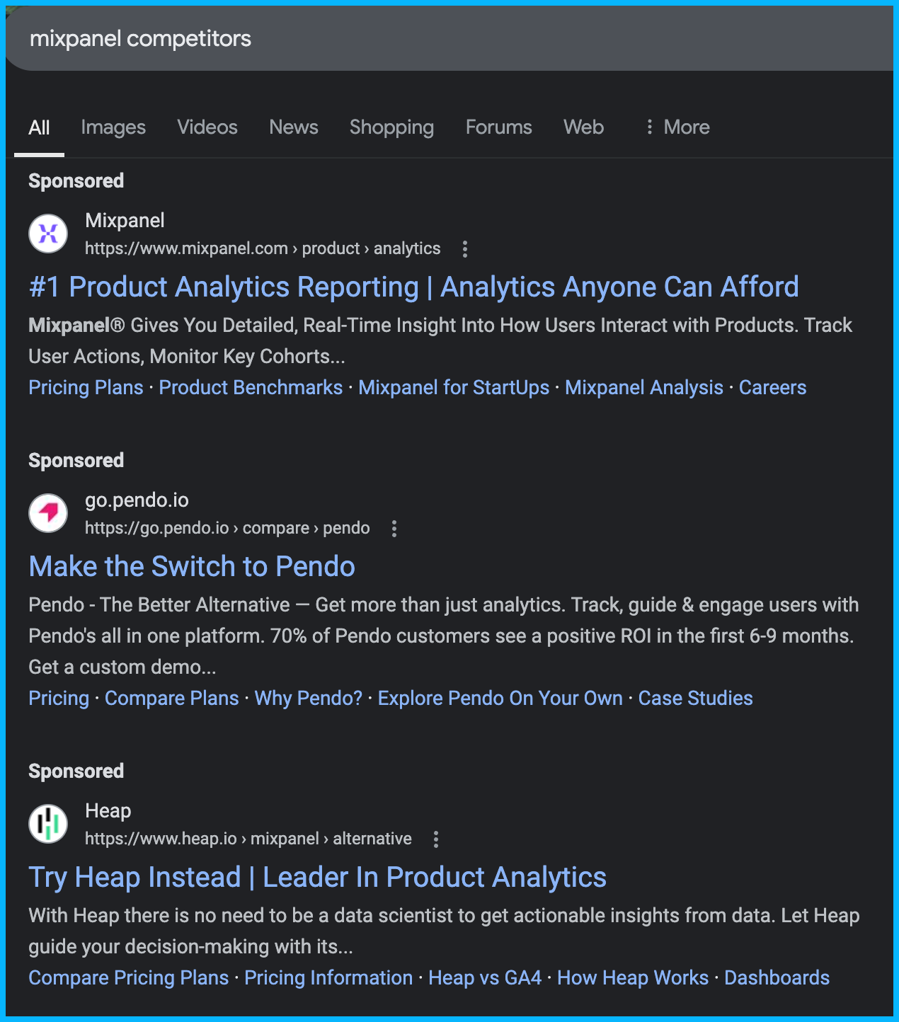
If you’re undecided about whether you should run brand campaigns or not, you can run a holdout study.
Stop running brand campaigns in a specific region — maybe start with one of your less important regions — and see if the amount of demos or trials goes down. If it does, you can assume that you’re losing out on pipeline and revenue by not bidding on your own terms.
Tip #10: Separate Brand and Non-Brand in your reporting
Brand and non-brand campaigns are completely different.
Brand campaigns are defensive. Someone already found out about your brand through other marketing efforts, and they’re looking for you specifically — you’re bidding on your own name in order to protect your brand from competitors trying to steal your traffic.
On the other hand, non-brand campaigns are offensive. You’re trying to show up for relevant solutions that your prospects might be looking for, and you’re trying to drive interest from a colder audience.
In other words, getting a conversion on a non-brand campaign is significantly more challenging than driving a conversion on a brand campaign; you need to separate these campaign types in your reporting to truly understand what’s working.
Bonus tip: Dive deeper into your performance by country
Most companies and ad agencies tend to look at performance by region, but completely ignore performance by country, which results in inefficient spending.
For example, if you’re targeting France, Italy, Spain, DACH, Nordics, and the UK in the same campaign, if you drill down and analyze performance by country, you might realize that all your spend is going to the southern European countries, which typically have more affordable CPCs.
And if you look further down the funnel, you might see that Spain, DACH, and Nordics are generating a lot of form submissions, but that all your pipeline is actually coming from the UK.
Ultimately, you want to ask yourself:
1. Are any countries cannibalizing my spend and do they need to be separated into different campaigns?
2. Are there countries that aren’t generating any form submissions that we might want to pause?
3. Are there countries that are generating submissions but never convert into pipeline that we might want to invest less money in?
If you ask yourself these questions consistently, you’ll be in a much better position than 99% of companies.
Hope you found this article helpful!
If you’re looking to learn more about Google Ads, check out these free Google Ads courses, that will teach you how to launch, optimize, and scale Google Ads campaigns effectively.
And if you have any questions about Google Ads or paid media in general, feel free to reach out on LinkedIn.
10 Unorthodox Tips to Maximize the Impact of Your LinkedIn Ad Campaigns
If you’re a marketer with some paid media experience, you’ve likely heard the same LinkedIn Ads advice many times: disable audience expansion, turn off the LinkedIn audience network, use manual bidding, etc.
This is all great advice, but following it doesn’t guarantee success – as the LinkedIn Ads market becomes increasingly saturated, it takes a more advanced approach to be successful.
Below, I’ll be sharing some less common strategies that my LinkedIn Ads agency has used to generate millions in revenue, and that you can implement to take your LinkedIn Ads performance to the next level.
TABLE OF CONTENTS
- Tip #1: Leverage the LinkedIn Insight Tag
- Tip #2: Implement a solid paid search strategy
- Tip #3: Review the intent of your search terms on Google
- Tip #4: Use video
- Tip #5: Communicate with your sales team
- Tip #6: Have a monthly and quarterly maintenance plan
- Tip #7: Experiment with organic content
- Tip #8: Use thought leader ads
- Tip #9: Leverage ad scheduling
- Tip #10: Use LinkedIn Sales Navigator to connect with your ICP
- Conclusion
Tip #1: Leverage the LinkedIn Insight Tag
This might sound silly, but I think it’s important to say it: Make sure you’re leveraging the LinkedIn Insight Tag to its full potential.
I’ve audited so many accounts where the insight tag isn’t installed and all the spend is going to cold audiences, and I’ve also seen accounts where the tag is installed, but the right audiences haven’t been set up.
As soon as you create your account, set up your 30, 90, and 180-day website visits remarketing audiences – these audiences are extremely high value and aren’t retroactive.
In other words, if you set them up 6 months after creating your account, you’ll miss out on 6 months of website traffic that you could retarget 😢

If you haven’t installed the insight tag already, check out this tutorial.
And for a full breakdown of the remarketing audiences you can create in LinkedIn Campaign Manager, take a look at this comprehensive guide.
Tip #2: Implement a solid paid search strategy
One of the best ways to improve your LinkedIn Ads results is to implement a solid paid search strategy – this could be Google Ads, Bing, or another paid listing.
Although LinkedIn’s targeting capabilities are incredible, you’re typically reaching a colder audience that isn’t actively searching for your solution, and have to take them from unaware to aware before driving conversions, which means longer sales cycles.
Meanwhile, with paid search, you can target people who are looking for your exact solution or researching the pain points you solve and shopping for vendors/solutions.
By running search ads and then retargeting with LinkedIn Ads, you can stay in front of in-market, warm audiences that are already problem and brand-aware, and significantly shorten your sales cycle. You can even qualify this in-market search traffic by layering in LinkedIn’s demographic and firmographic targeting filters on top of your warm website traffic to only retarget high-fit prospects.
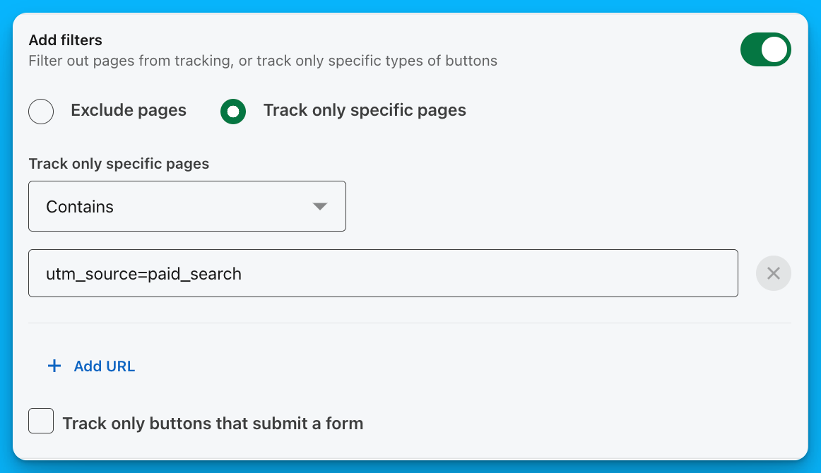
Pro tip: If you’re investing a lot of money in paid search (30K+/month), you might be able to create a custom LinkedIn Ads remarketing audience with the UTM source “paid_search”, or “cpc”, or “google”. This way, you’ll only retarget high-intent prospects who have already clicked on your search campaigns.
Tip #3: Review the intent of your search terms on Google
There’s no point in running search campaigns if you’re not getting in front of your ICP.
If you’re a performance marketer working at an agency, make sure you communicate with in-house marketers to confirm you’re showing up for the right search terms – their feedback is essential, because they know their business and ICP better than you do.
To make things simple, send the team a search terms report bi-weekly or monthly, and ask for feedback on what to exclude.
By doing this, you’ll improve the quality of your Google Ads traffic, and also significantly improve the quality of your LinkedIn Ads remarketing audiences.
Tip #4: Use video
Video is one of the most impactful formats on LinkedIn, as it allows you to build trust, communicate your value, and showcase your personality more effectively than images.
If you work at a service-based company, you can steal the exact strategy I use at my agency:
1. Target your cold audience with videos that clearly describe what you do and what problems you solve – these videos don’t have to be super exciting, but they do have to be relevant to the right audience and weed out people who aren’t in your ICP.
2. In remarketing, use clips of yourself speaking on well-known podcasts – this will help you build more credibility with your ICP and make them more likely to reach out.
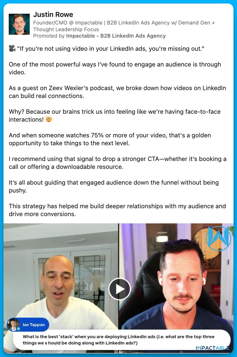
If you‘re selling a product instead of a service, run video ads showcasing how leaders in your industry use your product to solve their problems – this third-party validation is extremely powerful and has helped my SaaS clients generate millions in revenue over the past few years.
Tip #5: Communicate with your sales team
There’s no point in having great CPCs, CTRs, and CPLs if the sales team has no interest in working with your leads.
At minimum, I’d recommend meeting with your sales team once a month to go over your lead quality – these conversations will help you refine your targeting and exclusions, and minimize the amount of ad dollars being wasted.
In addition to this monthly check-in, you can go one step further and set up automated lead alerts in Slack (using Zapier). When these alerts come in, your sales team can react – thumbs up for a good lead and thumbs down for a bad one – and you can use these reactions to get real-time feedback and make quick pivots in targeting.
Tip #6: Have a monthly and quarterly maintenance plan
This might seem a bit boring, but it’s important to have a monthly and quarterly maintenance plan for your account – the same way you have a maintenance plan for your car or for your health.
For example, if you launched new video campaigns, did you create video view audiences and add them to your remarketing campaigns? Is your insight tag still active and picking up website traffic? Is your ad budget staying on LinkedIn and not being wasted on the LinkedIn audience network? Are your conversion events still functional, or do you have to update them due to changes in your website URLs?
Without these consistent checks, things can easily go awry and you can waste thousands or even millions of dollars.
Here’s the exact maintenance checklist that we use with our clients – feel free to make a copy and use it for your own accounts.
Tip #7: Experiment with organic content
If a piece of content performs well organically, it will most likely also perform well as an ad.
Use organic social media as a testing ground – test different pain points, messages, formats, and styles, on both personal accounts and your company page, and make note of what’s attracting meaningful DMs and high-quality leads.
Once your posts have received a solid amount of engagement, you can boost them to your ICP and turn them into evergreen assets that will continue to generate inbound leads with minimal effort.
By maximizing distribution via paid, you’ll improve your organic performance, and by testing new concepts via organic social, you’ll improve the ROI on your paid media efforts.
Tip #8: Use thought leader ads
Posts from thought leaders will consistently outperform ads from company pages. This is partially due to a mindset shift – when we post from our personal pages our reputation is on the line, so we try to be less promotional and more helpful.
That being said, even if you promote the same exact post from a company page vs a thought leader’s page, the thought leader ad will typically perform better – this confirms that the saying is true: people want to buy from people, not companies.
By running thought leader ads, you can expect to see:
1. Increased engagements, which will allow you to build your remarketing audiences more quickly
2. An increase in LinkedIn DMs from qualified prospects
3. A spike in organic search traffic
4. An incremental lift in conversions (my agency saw a 15-20% increase)
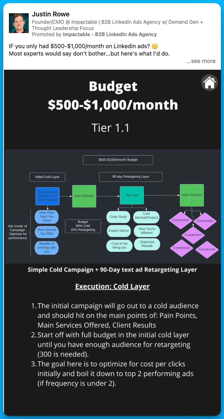
Pro tip: Experiment with different types of thought leader ads (videos, images, text, custom graphics) and double down on whatever works best.
Tip #9: Leverage ad scheduling
LinkedIn Ads start running on UTC time (8 p.m. EST), which means that a lot of companies are spending their money at nighttime and run out of budget by 5 or 6 a.m. – this leads to poor performance, as prospects are typically not as receptive to ads at these hours.
With ad scheduling, you can ensure that your ads are showing up at the right times.
For my agency, I like to run ads from 5 a.m. to 2 p.m. EST, pause in the afternoons, and restart in the evenings. For you, this schedule might look a bit different, based on when your ICP is most active.
In addition to scheduling, it can also be interesting to experiment with ad rotation, especially if you’re a smaller company with limited budget.
For example, you could run 3 campaigns on Monday, Wednesday, and Friday, and 3 different campaigns on Tuesday, Thursday, and Saturday.
Typically, to run 6 campaigns you’d need a budget of at least $60/day (due to LinkedIn’s $10/day per campaign minimum), but with ad rotation, you’d only need $30/day – in other words, your budget would go a longer way and you’d be able to reach more audiences.
Ad scheduling and rotation may not be necessary if you have a massive budget and are targeting a broad audience, but it can make a huge difference if you’re spending under $30K/month and want to make the most of your budget.
To get started with ad scheduling and ad rotation, you can use DemandSense, a tool that we developed at my agency.
Tip #10: Use LinkedIn Sales Navigator to connect with your ICP
If you’re experimenting with LinkedIn organic, paid, and thought leader ads, it’s a great idea to connect with your LinkedIn profile visitors to maximize the impact of your efforts.
Here’s exactly how you can do this:
1. Set up a filter in LinkedIn Sales Navigator for people who have visited your profile, aren’t connected with you (2nd or 3rd degree connections), and fit your ICP criteria (right company size + seniority level)
2. Send connection requests to these people on a weekly basis – in my experience, it’s best to send blank connection requests to avoid coming across as a salesperson
3. Once your connection request has been accepted, send a simple intro message such as: Hey X, saw you checked out my profile and thought it would be good to connect. If you ever have any questions about LinkedIn Ads or want to talk about B2B marketing, let me know. Here's the link to some resources that people commonly ask me for: [insert valuable link]
With this approach, I typically see about a 60% acceptance rate, and I always get a lot of follow up questions, such as: Do you work for X company? Have you experienced X problem?
Plus, a lot of prospects end up visiting my company website, which means that I can stay in front of them for a longer period of time, since they get pulled into my LinkedIn remarketing audience.
Pro tip: You can start by doing this process manually with LinkedIn Sales Navigator, but you can also automate and simplify the process by using a tool like PhantomBuster.
Conclusion
Even if you’re doing everything right on LinkedIn – communicating with sales, using video, experimenting with organic social, amplifying your thought leadership, etc. – don’t expect to see tons of demos and opportunities right away.
Facebook Ads, Google Ads, and email are very transactional channels, but LinkedIn Ads are more similar to SEO – it takes time to see results but your efforts will pay dividends down the road.
Hope you found this article helpful!
Feel free to reach out with any questions about LinkedIn Ads or paid media.

10 Tips to Drive Pipeline Acceleration with Paid Media
Most B2B SaaS companies have a two-dimensional approach to paid media: prospecting campaigns to generate awareness, remarketing campaigns to capture demand.
This isn't necessarily wrong, but there are so many more possibilities, such as moving existing open deals faster to close – this is called pipeline acceleration.
As a Demand Marketing Manager at Unmuted, I've helped my B2B SaaS clients drive revenue through pipeline acceleration.
Here are my 10 tips on how to make this playbook work for you 👇
TABLE OF CONTENTS
- Tip #1: Communicate the goal to your internal stakeholders
- Tip #2: Start targeting your open opportunities with LinkedIn Ads
- Tip #3: Tailor your messaging to different personas
- Tip #4: Measure the impact of your campaigns
- Tip #5: Don’t forget to exclude your customers
- Tip #6: Apply the same playbook to upsells and cross-sells
- Tip #7: Incorporate different channels into the mix
- Tip #8: Use thought leader ads
- Tip #9: Leverage signals to understand how deals are progressing
- Tip #10: Use insights from closed lost campaigns to tweak your strategy
Tip #1: Communicate the goal to your internal stakeholders
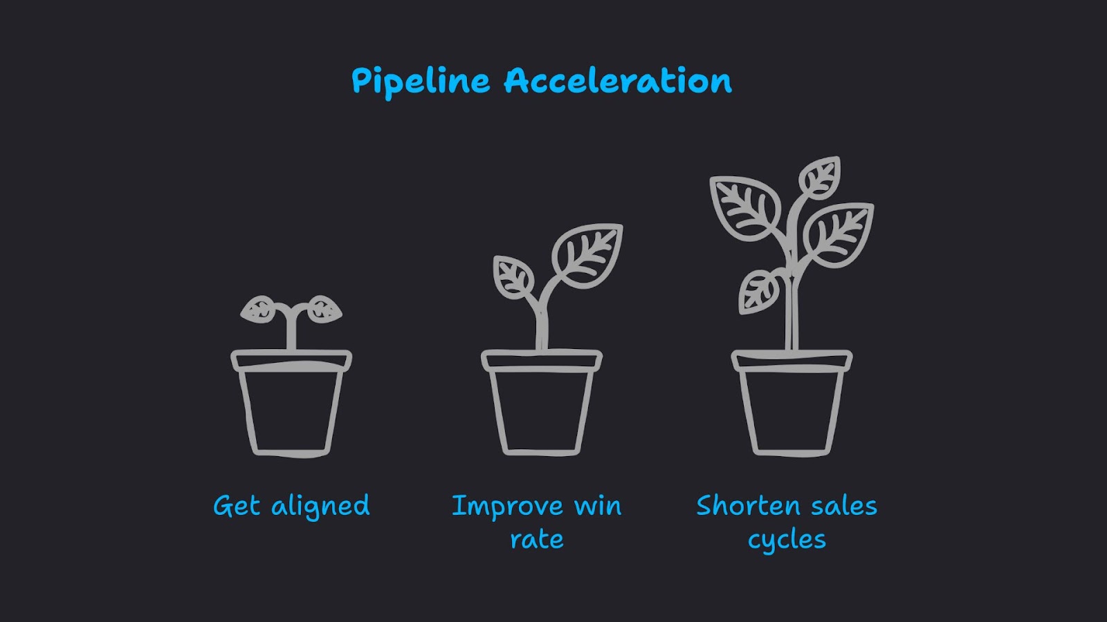
Before running any pipeline acceleration campaigns, make sure your executive team understands that the goal is NOT to drive new opportunities, but to increase the rate (and speed) at which open opportunities turn into revenue.
This might seem basic, but without this alignment, your campaigns may be considered a failure and paused prematurely, even if they’re extremely successful.
Tip #2: Start targeting your open opportunities with LinkedIn Ads
Once you have buy-in from internal stakeholders, I recommend getting started with LinkedIn Ads.
For your targeting, you can create a dynamic list of open opportunities in HubSpot and connect it to LinkedIn Campaign Manager. And if you’re using another CRM, such as Salesforce, you can send your open opportunities to LinkedIn Campaign Manager via Zapier.
On top of this company list of open opportunities, you’ll want to layer on job titles within your DMU (decision-making unit) – these are all the people that may be involved in sales conversations.
For example, if you’re selling an attribution tool, you might want to reach RevOps, Marketing, Sales, and Business Development job titles at your target accounts.
Marketing job titles (VP of Marketing, Head of Demand Gen, Chief Marketing Officer) will likely push the deal forward, but other departments will need to sign off in order for a purchase to be made. By building trust within all these key departments, you’ll increase the likelihood of a deal moving over the finish line.

Pro tip: If you don’t have a massive list of open opportunities, you may not be able to layer on job titles, as your audience size will be too small. If you run into this issue, try using job function targeting instead.
Tip #3: Tailor your messaging to different personas
If you have a large enough audience size to do so, consider creating different campaigns for each persona within your DMU (decision-making unit). For example:
Campaign 1: Open opportunity companies + Marketing job titles

Campaign 2: Open opportunity companies + Finance job titles

Campaign 3: Open opportunity companies + Sales job titles
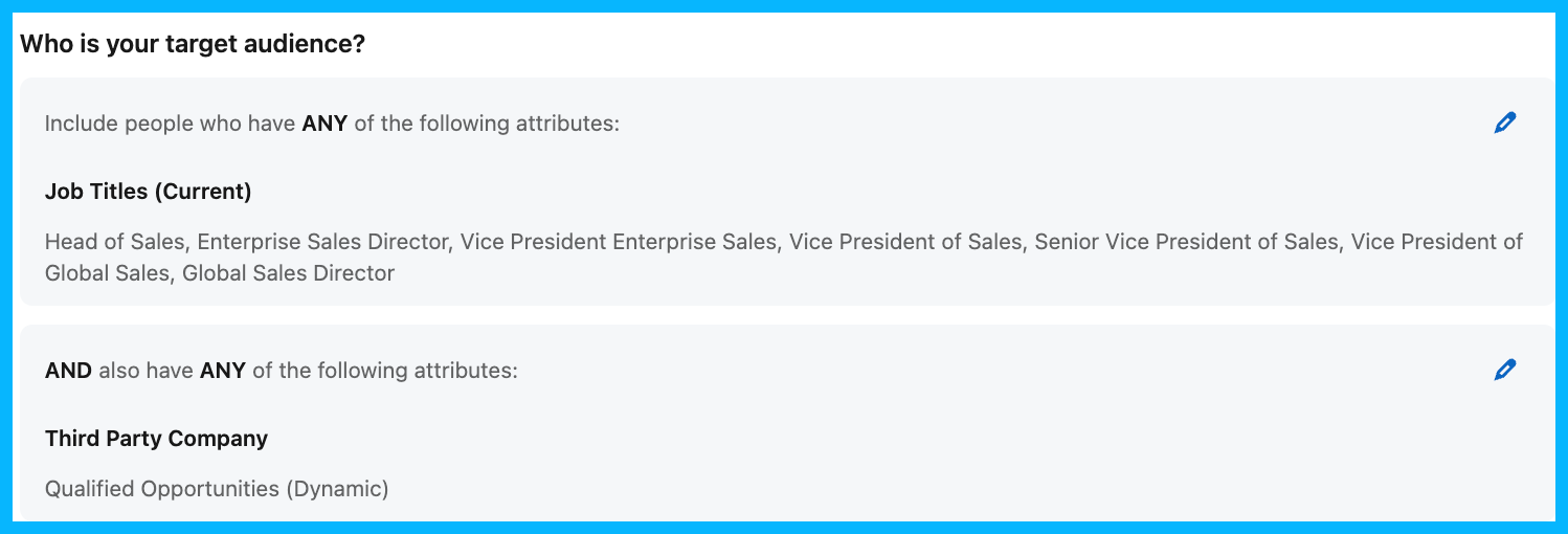
By separating these different personas into different campaigns, you can create messaging that’s more relevant to each department – marketing ads could focus on measurement, finance ads could focus on revenue, sales ads could focus on closing more deals, etc.
With more tailored messaging, your ads are more likely to resonate and leave an impression on different departments.
Tip #4: Measure the impact of your campaigns
Once your campaigns are live, you need a way to measure (and prove) that they’re working.
Here’s how I recommend doing it:
1. When a deal closes, go to the Companies tab in LinkedIn Campaign Manager and see how many impressions (and engagements) the Closed Won company received. If you see a lot of impressions and engagements, it’s safe to assume that your ads played a role in the eventual conversion.

2. To take things up a level, consider using a tool like Fibbler, which sends ad impressions on a company level back into HubSpot – this will allow both your marketing and sales team to see how many ads companies saw before making a purchase.
3. If you have a larger budget, consider investing in a tool like Dreamdata or HockeyStack, which will provide more details on the incremental lift driven by your pipeline acceleration campaigns.
4. For a true A/B test, manually split your open opportunities into two different groups, and expose only one of them to the pipeline acceleration ads. Are the exposed companies closing faster and at a higher rate?
5. To further understand the impact of your campaigns, ask the POC of your new customers if they happened to see your ads, and if those ads influenced their decision in any capacity.
Tip #5: Don’t forget to exclude your customers
This is simple, but extremely important: Don’t forget to exclude new customers from your pipeline acceleration campaigns.

If your customers continue seeing ads from your company during their onboarding phase, you may end up annoying them, in addition to throwing money down the drain.
Making these exclusions is straightforward: when a company transitions from opportunity to closed won in HubSpot, they should be added to a new dynamic list of customers, which can be connected to LinkedIn Campaign Manager and added as an exclusion list in your pipeline acceleration campaigns.
If you’re using a different CRM, the process is similar, you’ll just have to make the connection through Zapier instead.
Tip #6: Apply the same playbook to upsells and cross-sells
Once this playbook is working well for pipeline acceleration, you can apply it (with a few modifications) to upsells and cross-sells.
For example, if you launch a new product, you could target a list of all your existing customers highlighting its capabilities, and outlining how it will enhance their existing workflows. Check out an example from ZoomInfo below:
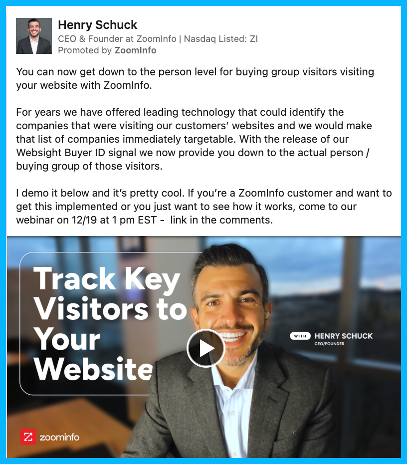
The possibilities are endless once you understand the fundamentals of LinkedIn’s targeting – any lifecycle stage can be targeted with relevant content and offers.
Tip #7: Incorporate different channels into the mix
Once LinkedIn Ads are working well for you, consider adding other channels and strategies into the mix to create a sense of omnipresence.
For example, maybe you could test Meta or Reddit retargeting ads (depending on where your audience spends the most time).
It’s also a great idea to leverage LinkedIn organic, to expand your reach beyond paid ads.
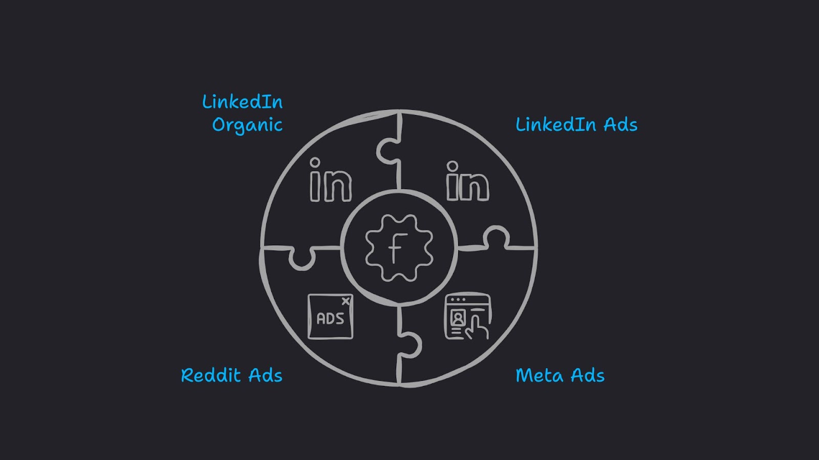
Your Head of Sales, Chief Commercial Officer, members of your marketing team, and other employees who are consistently posting on LinkedIn can connect with people within the DMU (Decision-making unit) at your open opportunity companies – this way, they’ll be seeing content from your organization constantly, and you’ll be top of mind throughout the entire sales process.
Tip #8: Use thought leader ads
To maximize the impact of your ads, you ideally want your team to be posting relevant content on LinkedIn, and you can take things to the next level by running thought leader ads, boosting the top performing posts from your team members to your list of open opportunities.
For example, if your Head of Sales makes a post related to the capabilities of your product and it goes viral, you can put some ad spend behind this post, targeting all your open opps – this will serve as great social proof, reassuring members of the DMU that working with your company is the right decision.
The added benefit of thought leader ads is that they don’t look like ads at all, and typically drive more interest and engagement than standard company ads.
Here’s a good example from Sendoso:
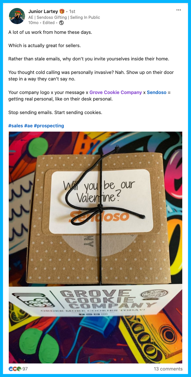
Tip #9: Leverage signals to understand how deals are progressing
To understand how deals are progressing, take a look at the signals that are available to you.
Is a specific company seeing your ads a lot? Are they engaging frequently? Are they going a step further and visiting your website? (you can easily see this using a tool like Warmly, LeadInfo, or Leadfeeder)
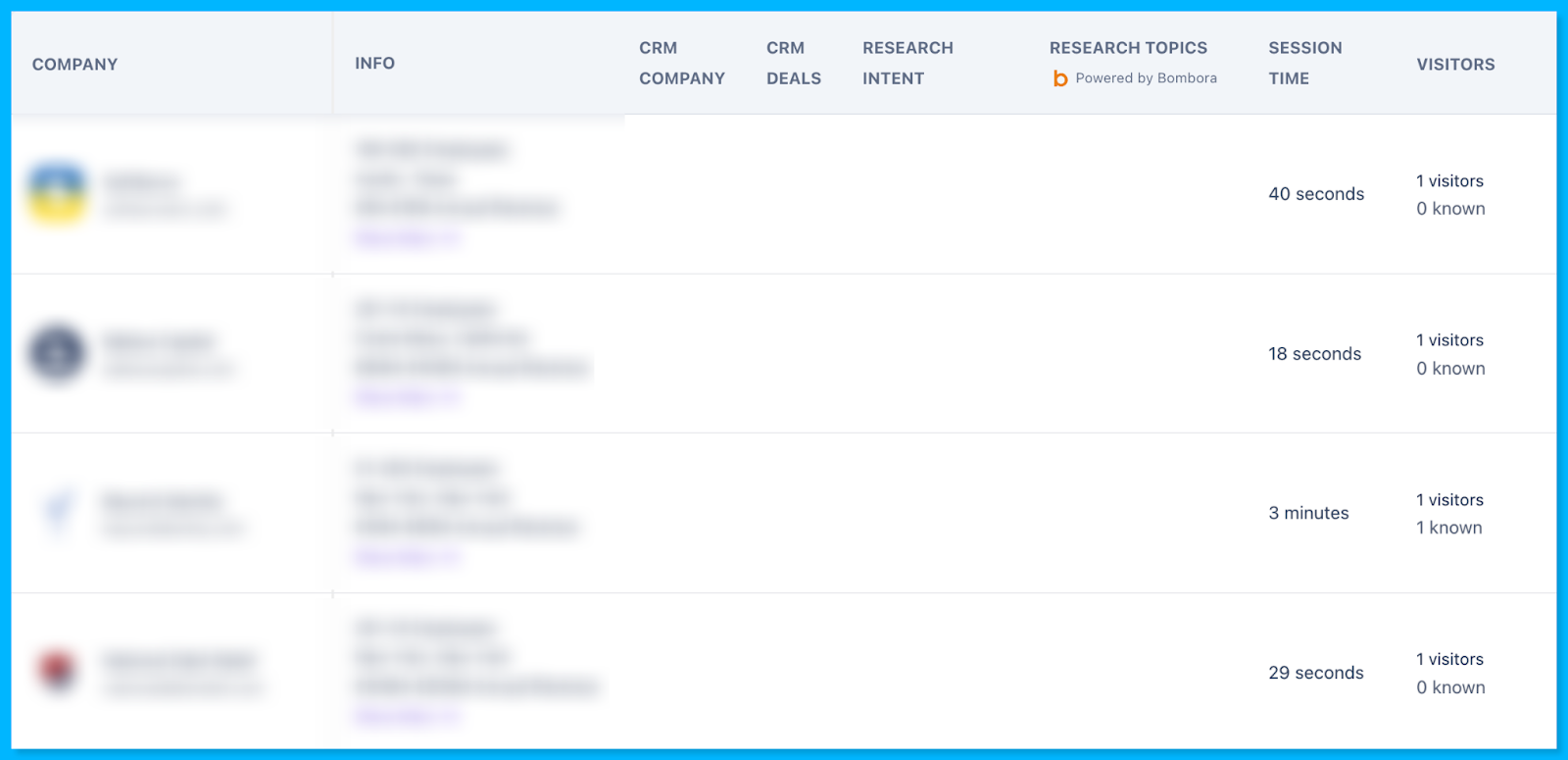
If you’re in the US and have access to person-level identification tools, you can even see some of the people that are visiting your site. For example, if the CFO, CMO, and CTO are all visiting your website, you can infer that the deal is progressing rapidly and chances of a purchase are high.
Tip #10: Use insights from closed lost campaigns to tweak your strategy
Keep a close eye on closed lost deals and look for recurring patterns.
Are you consistently losing on pricing, timing, or to a specific competitor?
This is great intel for messaging in future pipeline acceleration campaigns – if you can get ahead of potential objections, the likelihood of an opportunity closing is significantly greater.
For example, let’s say you’re reviewing a year of data and notice that you lost most of your deals to a specific competitor.
In your future pipeline acceleration campaigns, you might want to run competitive ads, highlighting the benefits of choosing your product. This might help prospects who are thinking of working with your competitor choose to work with your company instead.
Here’s a great example from Cognism:
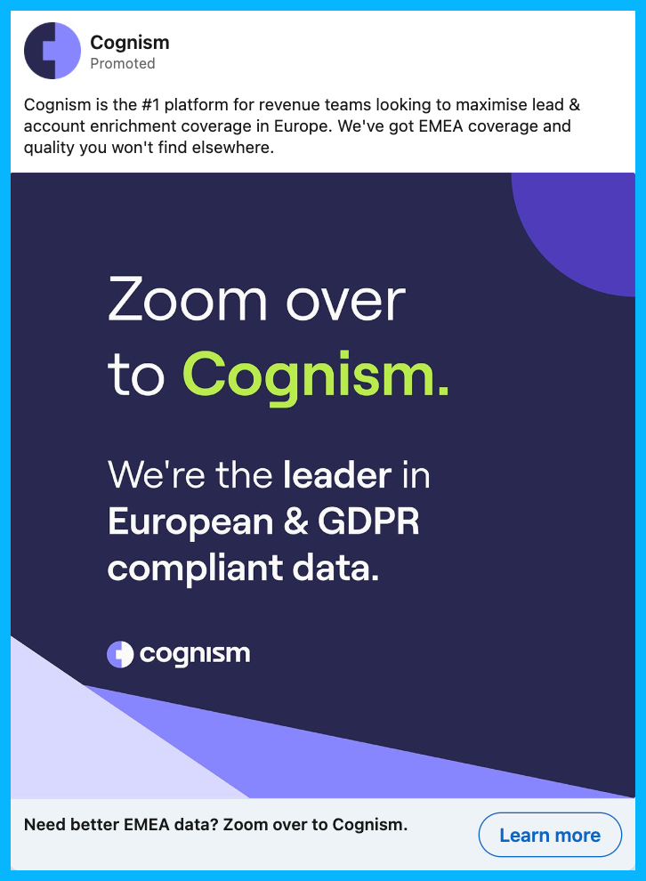
Hope you found this article helpful!
Feel free to reach out on LinkedIn with any questions about pipeline acceleration, paid media strategy, or B2B marketing.

How to Scale Outside of Paid Search with YouTube Ads & Demand Gen Campaigns for B2B SaaS
Hey there, if you’re a B2B marketer looking to scale your Google Ads campaigns, you’re in the right place.
In this article, I’ll walk you through how to effectively use YouTube Ads and Google Demand Generation (previously known as Discovery) campaigns to scale beyond paid search and stay top of mind while keeping costs low.
So let’s dive in! 👇
TABLE OF CONTENTS
- Why You Need to Scale Beyond Paid Search
- How to Leverage Custom Audiences
- How to Stay Omnipresent with Remarketing
- From Clicks to Conversions: Master Google Ads for B2B
Why You Need to Scale Beyond Paid Search
Search campaigns are fantastic for capturing high-intent users, but eventually you’ll hit a wall. Why? There’s only so much traffic coming from people searching for your keywords (especially in B2B).
As I always say, Google Ads is a blessing and a curse. You’re blessed with intent but cursed with scale.
So to break through, it’s necessary to explore other types of Google Ads campaigns.

Video and Demand Gen campaigns, in particular, are great for that because they let you reach a broader audience on YouTube, Gmail, and Discover at a fraction of the cost per click you’d pay for high-intent search terms.
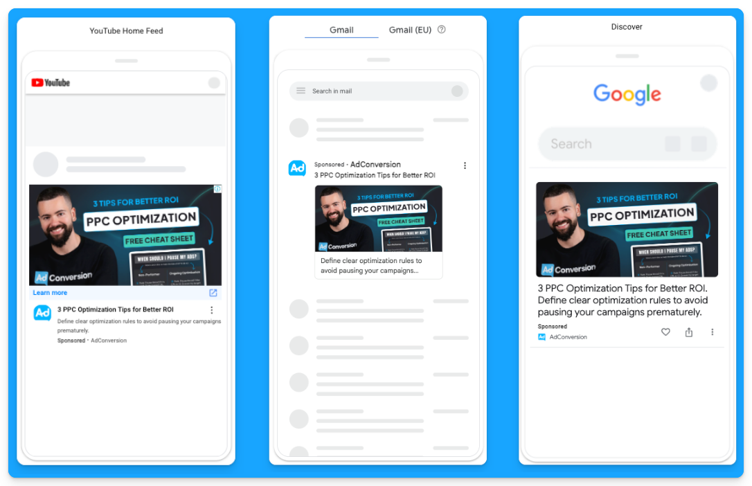
For example, instead of paying $100 per click for “CRM software”, you could pay just $0.05 per view on YouTube, targeting the same audience.
It’s a game-changer for SaaS companies looking to grow.
How to Leverage Custom Audiences
You may ask how you can get LinkedIn-like targeting with YouTube Ads and Demand Gen campaigns since we can’t rely on job titles or target specific companies.
The secret to successful prospecting with these channels lies in custom audiences.
These are people actively searching for your top-performing keywords, competitors, or industry terms.
Custom segments let you target users based on search behavior, getting your brand in front of highly relevant prospects at just the right time.
Here’s how you can create custom segments on Google Ads:
- Go to “Tools” on the left-hand side of your Google Ads manager
- Click to expand the “Shared library” option and go to “Audience Manager”
- Click on the “Custom segments” option
- Click on the plus sign to create a new custom segment
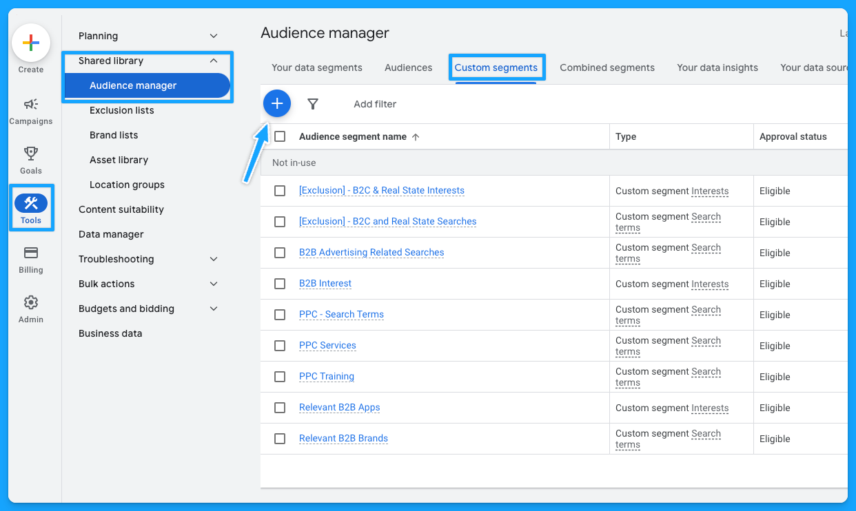
Below is a custom segment I created to target people with any interest or purchase intentions in B2B-related terms and tools and how many impressions I can get per week with this segment.
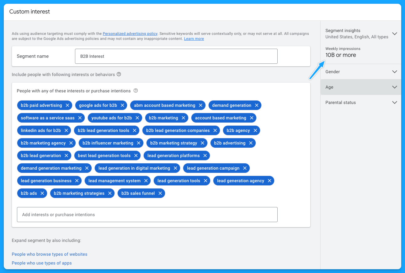
I also recommend creating custom segments with the following:
- Relevant B2B Apps (especially if they integrate with your product)
- Your competitors
- Relevant B2B Brands
- Your high-converting paid search keywords
- Irrelevant B2C Interests/Searches for exclusion if needed
As I pointed out, by using these custom audiences, you can target people who have searched specific terms on Google through Demand Gen or YouTube campaigns. Instead of paying a premium cost for search clicks, you’re reaching them on different platforms for dramatically less.
If you want to learn more about YouTube costs check out this benchmark data we pulled from $1,041,988 in ad spend from our own B2B SaaS clients.
Staying Omnipresent with Remarketing
In B2B marketing, sales cycles can range from months to years, so another great option to leverage Video and Demand Generation campaigns on Google Ads is using remarketing audiences to stay top of mind with your prospects.
Running remarketing campaigns on YouTube, Gmail, Discovery and Google Display allows you to re-engage visitors who’ve interacted with your site or content.
For example, you can create specific segments based on user activity, such as visiting your pricing page, blog, case studies, or downloading a resource.
Here are some of the remarketing segments I recommend most for B2B SaaS companies:
- Pricing Page Visits
- Product Page Visits
- Prospects that downloaded a resource
- Prospects that attended webinars or in-person events (custom list)
- Demo Page Visits (excluding users that filled out the form)
- Trials (for PLG companies)
- Case Study Visits
If you’re running LinkedIn Ads and confident in your audience targeting, you can also steal that LinkedIn Ads traffic by remarketing them on Google 🔥
To do that, you just need to build a retargeting audience using utm_source=linkedin or whatever utm_source you use for your LinkedIn Ad campaigns.
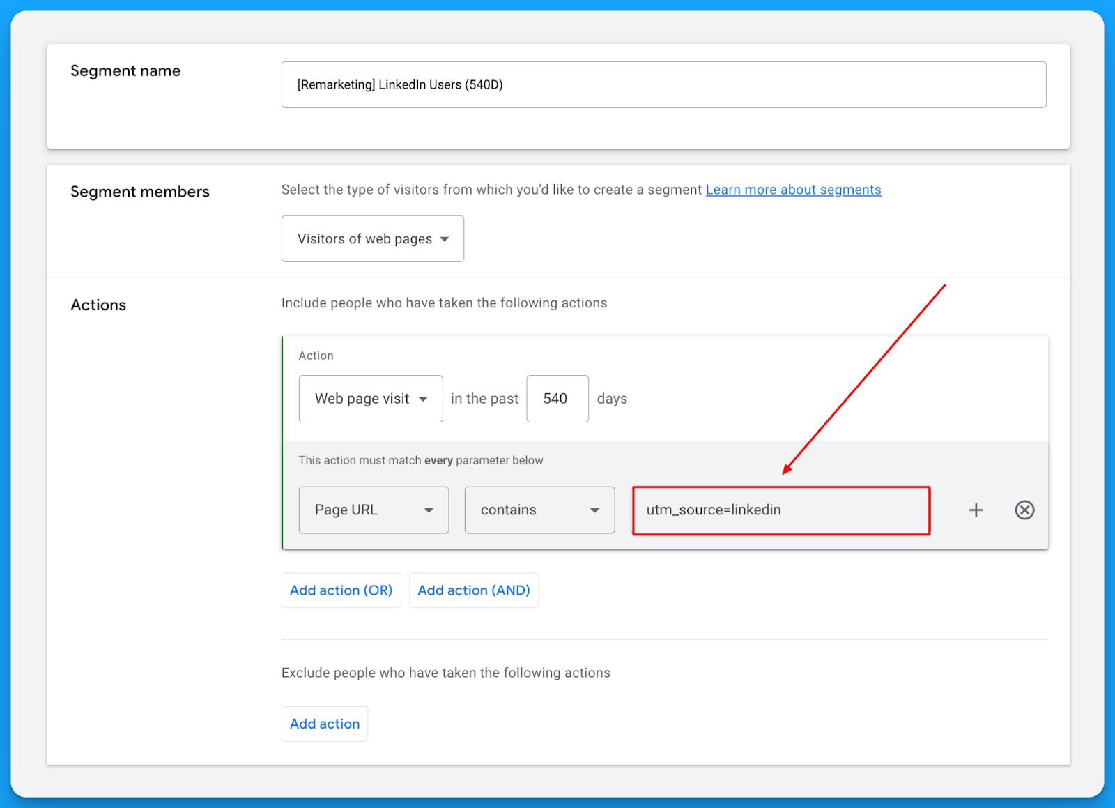
This will let you get in front of the same users on YouTube, Gmail, Discovery, and Display for a fraction of the cost you’re paying on LinkedIn. 🤓
Check out our free LinkedIn Ads courses to master this channel:
- B2B LinkedIn Ads 101: The Ultimate Crash Course for New LinkedIn Advertisers
- B2B LinkedIn Ads 102: The Blueprint for LinkedIn Ads Optimization
- B2B LinkedIn Ads 103: Advanced Scaling Strategies From $25M in Ad Spend
The beautiful thing about remarketing is that it deals with smaller audience sizes and requires less budget, but it keeps you in front of the people who matter most.
So I highly recommend building a multichannel B2B retargeting strategy to ensure your brand stays visible, nurturing prospects throughout their long decision-making process.
You can steal my YouTube Remarketing Checklist to ensure you don’t forget anything when creating your campaigns.
Final Words
Scaling beyond search campaigns, leveraging custom audiences, and using remarketing are your keys to running successful B2B SaaS campaigns on YouTube and Google Demand Generation.
These strategies let you break free from search constraints, attract new prospects efficiently, and remain top of mind throughout the sales cycle.
If you have any questions, feel free to connect with me on LinkedIn.
From Clicks to Conversions: Master Google Ads for B2B 🔥
If you want to become a Google Ads pro, check out our free B2B Google Ads courses, where you'll learn how to launch, optimize, and scale your campaigns to drive pipeline and revenue.

Here's what you'll learn in each course:
⚙️ B2B Google Ads 101 - How to Launch Dangerously Effective Campaigns for Beginners
- The Googleverse: The Game You're Playing & How To Win
- Measurement: How to Make Sure You're Profitable
- Targeting: How to Show Up For the Right Searcher
- Planning: Putting It All Together
🎯 Google Ads 102 - How to Clicks Into Profit
- Visibility: How To Find the Hole Sucking Profits
- Workflows: How to Optimize On a Daily, Weekly, Monthly & Quarterly Basis
- Experimentation: How to Test & Automate Profitability
- Troubleshooting: How To Solve Inevitable Problems
🚀 Google Ads 103 - How to Scale Google Ads For Advanced Advertisers
- Methodology: How to Vertically Scale Google Ads From A-Z
- Campaigns: Scaling Horizontally Through Campaign Themes
- Channels: Scaling Outside of Paid Search
Click Here to Join 1,000+ B2B Marketers Today and start leveling up your advertising skill set.
Takes < 90 seconds to sign up (seriously we timed it 😂)
3 Messaging Mistakes B2B SaaS Companies Make in Their Ads (and How to Fix Them)
Paid ads have the potential to be the biggest revenue driver in your business. Not to mention, they are one of the fastest ways to build brand awareness.
But if you are like most B2B SaaS companies, you probably find that a large portion of ads you run drive a less-than-impressive CTR or an astronomical CPL.
Before you switch strategies or try another platform, we need to look at your ad copy. One study found that 75% of B2B LinkedIn ad creative was ineffective, ranking just one star or less out of five 😱
Here are 3 common mistakes SaaS companies make in their ad messaging. Read on to learn what they are and how you can fix them today.
TABLE OF CONTENTS
- Mistake #1: Showing the what but not the how
- Mistake #2: Trying to fit too much in one ad
- Mistake #3: Using buzzwords
Mistake #1: Showing the what but not the how
You need to get specific about the core features of your product.
You might be thinking, well duh!
But you would be surprised at how many ads fail to clearly communicate how their product actually achieves the awesome results that it does.
If you search the LinkedIn ad library, you’ll find it awash with ads like this ⤵
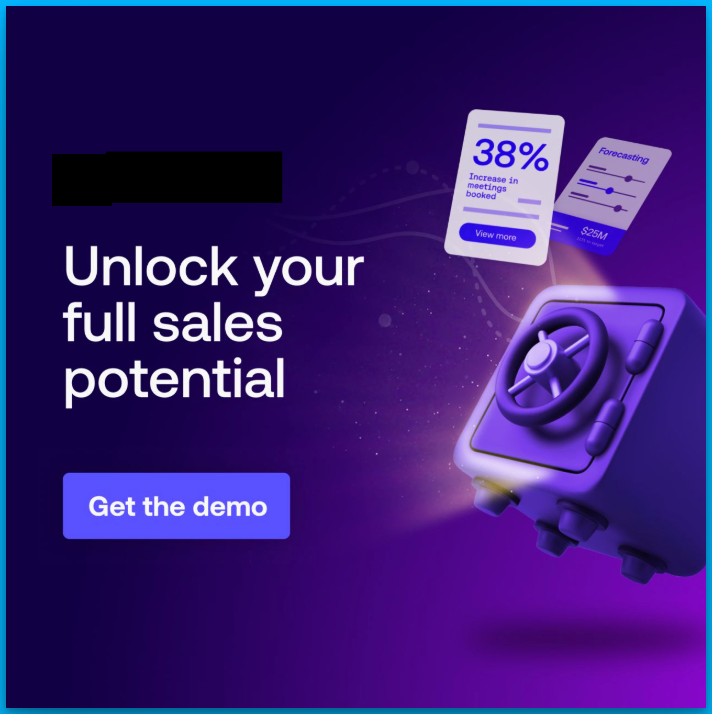
And while, yes, everyone wants to make more sales, statements that solely focus on a result, without explaining the how, leave people in the vague zone.
The mind craves certainty, tangibility and proof. So you’ll want to get out of the vague zone and into the land of specificity as quickly as possible.
Here’s how to fix it
In our B2B ad agency, we have consistently seen this formula perform again and again.
1. Hone in on one specific feature
2. Clearly tie it to a very specific outcome
3. Show how the feature actually achieves that outcome
(Bonus if you combine it with a visual snapshot of this process happening on the platform)
Let’s take an example.
Imagine you are an analytics company that tracks user behavior on your website.
Your product has a LOT of functions, but it essentially allows marketing teams to understand what users do on your website, so they can improve user experience and ultimately make more sales.
Usually, something like this happens. You simplify the whole process and end up with a headline like “Turn data into dollars.”
Short and catchy, right?
Maybe. But if you ask the marketing manager reading the ad to explain what they’re actually getting? They will have no idea.
Try this instead.
Think about one core feature of your product that customers like.
In this case, it could be tracking when customers drop off during the sales process.
Focus the whole ad around that feature.
For example, we could say something like “See when customers drop off, remove obstacles that stop them buying.”
Ok, you can make it catchier than that.
But this version allows our audience to really understand how the product helps them.
Combining this with a visual to show what we mean is also a game changer. Here this might look like a simplified snapshot of a tracking dashboard, with a notification that says “462 users dropped off at checkout.”
This ad is now:
⤷ Tangible
⤷ Our audience gets what our product does
⤷ And instead of spelling out the result, we make it easy to make the connection between this feature and making more sales.
Here’s a real example from one of my clients, a data analytics platform. It hones in on one specific feature that allows you to watch replays of users navigating your platform:
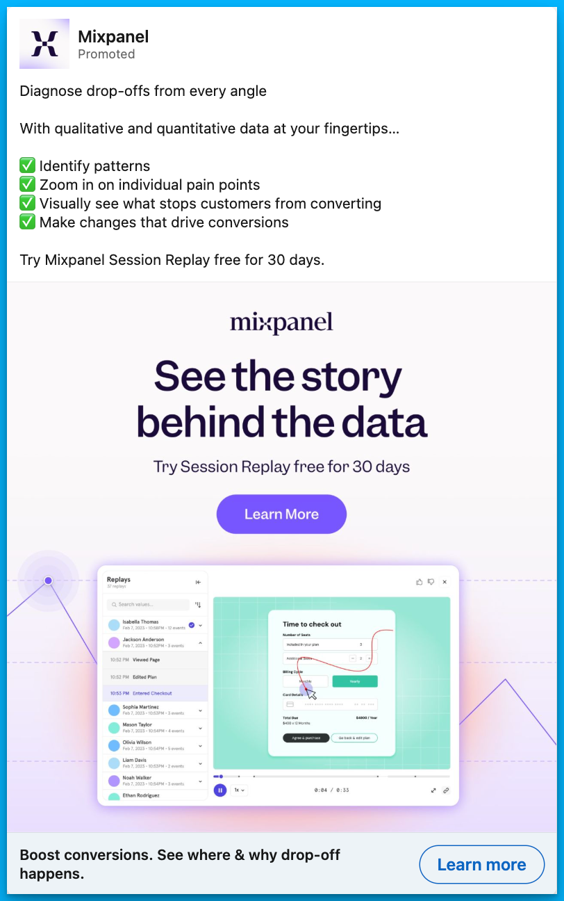
Mistake #2: Trying to fit too much in one ad
When you work closely on a product, you are acutely aware of ALL its awesome features.
But, that doesn’t mean you should mention them all in a single ad.
While you might think everything is important, speaking to too many benefits or features can confuse or overload your audience, ending up something like this ⤵
The more you make your audience work to understand your product, the more likely they won’t remember your ad at all.
Speaking to one benefit in one ad is typically much more memorable.
The goal of an ad in SaaS isn’t usually to make an outright sale – B2B sales processes are far too long and convoluted for that.
Instead, we want to pique our audience’s interest just enough to click to learn more.
They can then dig further into your features on the website or landing page.
Here’s how to fix it
So how can you avoid saying too much?
Let’s take an example.
Imagine you have a marketing automation software that:
- Automates email campaigns
- Segments audiences
- Includes prebuilt templates
- Connects to a CRM
- Integrates with tools
- AND has analytics capabilities
You might be struggling to know what to focus on.
Try this.
Choose a real-life use case. For example, reviving abandoned cart sales with automated emails.
Instead of listing features, your ad might say something like:
“70% of shoppers abandon their cart. Bring them back with set-and-forget followups you can activate in a few clicks.”
Not only does this hone in on one easy-to-grasp feature, it also helps your audience imagine implementing and benefiting from the product.
Here’s another example from one of my clients, a customer feedback analytics platform. It focuses on the use case of automating feedback tagging:
Mistake #3: Using buzzwords
We know we shouldn’t use buzzwords, but still, it’s a constant battle not to let them worm their way into B2B content.
I get it.
⤷ Everyone else is using them
⤷ They are an industry norm
⤷ And they neatly encapsulate what we want to express
But ultimately, they are the lazy way out. And they are killing your conversions.
So the next time you feel the urge to harness, unlock, optimize, revolutionize, supercharge, streamline, or transform in your B2B ads, try this 👇
Do the tangibility test.
- Can your claim be proved right or wrong?
- Could you go away and draw it on a piece of paper?
If the answer is no, keep reworking it until it’s a yes.
Here’s how to fix it
Let’s take the headline of this ad ⤵
Could you prove with a yes or no if this company can ‘streamline product drops’? Erm, I’m not really even sure what that means.
Could you draw ‘streamlining a product drop’ on a notepad? Me neither.
I did some digging and learned that this company offers a platform where brands can run eCommerce launches.
So let’s adapt the headline to something like this.
“Launch your new clothing line on a platform that will never crash.”
Could you prove it’s possible or not to launch products on this platform? Yes.
Could you prove it to be true or false that the platform will never crash? Yes.
Could you draw this concept on a piece of paper? I could give it a good shot.
Here’s an example for one of my clients, where I used conversational and human language over buzzwords to promote a webinar:
Final Thoughts
Great SaaS ads don’t have to be flashy or loaded with buzzwords. They succeed when they:
- Show how they achieve the outcome
- Focus on a single message at a time
- Use clear, tangible language over jargon
By avoiding these three common messaging mistakes, you’ll not only boost your click-through rates but also connect with your audience in a way that builds trust and drives action.
Now, go audit your ad copy—what changes can you make today?
Hope you found this article helpful! 👏
Feel free to reach out on LinkedIn with any copywriting questions.
And for more B2B SaaS copywriting tips, check out this article by Eden Bidani.
Free Resources to Build a Full-Funnel Paid Media Program
If you want to build a full-funnel B2B paid media program, then you should definitely check our free course Building a Paid Media Program: Scale Your B2B SaaS Advertising.
Here’s what is in for you:
- Module 1: you'll learn the S.C.A.L.E framework for building a paid program.
- Module 2: you'll learn how to create your paid strategy with the five stages.
- Module 3: you'll learn how to measure your paid media program correctly.
- Module 4: you'll learn how to create world-class campaigns from A-Z.
- Module 5: you'll learn how to create an experimentation engine.
- Module 6: you'll learn how to scale with the Scaling Quadrant.
It doesn’t matter if you’re a seasoned B2B advertiser or a complete newbie.
You’re going to walk away with frameworks and repeatable processes for building a paid media program that scales.
Click Here to Join 1,000+ B2B Marketers Today and start leveling up your advertising skill set.
It takes < 90 seconds to sign up (seriously we timed it 😂)
People Also Ask
How can I effectively measure the impact of improved ad messaging on my campaign performance?
Utilize A/B testing to compare different ad copies and analyze metrics like click-through rates (CTR), conversion rates, and cost per acquisition (CPA) to determine which messaging resonates best with your audience.
What are some strategies to ensure my ad messaging aligns with my target audience’s pain points and needs?
Conduct thorough market research, including customer surveys and interviews, to gain insights into your audience’s challenges. Use this information to craft messages that directly address their specific concerns.
How can I balance creativity and clarity in my ad messaging to effectively communicate my value proposition?
Focus on clear and concise language that highlights the unique benefits of your product. While creativity can capture attention, clarity ensures the message is understood and compelling.
What role does audience segmentation play in crafting effective ad messages for B2B SaaS products?
Segmenting your audience allows for personalized messaging that speaks directly to the needs of different groups, increasing relevance and engagement. Tailor your ad copy to address the specific pain points of each segment.
How can I avoid using jargon or buzzwords in my ad messaging while still appearing knowledgeable and credible?
Use straightforward language that clearly explains your product’s benefits. Focus on how your solution solves problems rather than relying on industry jargon, which can alienate or confuse potential customers.


%20-%20new%20v2.png)


